This post contains affiliate links. If you buy through them, I may earn a small commission at no extra cost to you.
Spring is a season of soft color and renewal, and pastels are the perfect medium to capture it. Their rich pigment and velvety blendability make them ideal for delicate florals, dreamy skies, and gentle landscapes. Here is how to bring spring’s softness into your art.

1. Why Pastels Suit Spring
- They blend smoothly for soft transitions.
- Their colors are vibrant yet delicate.
- They are versatile for sketching, blending, and layering.
My pick: a professional soft pastel set.
2. Choose a Spring Palette
- Blush pink for cherry blossoms and florals.
- Mint green for new leaves.
- Sky blue for clear spring skies.
- Lavender for a dreamy touch.
- Butter yellow for sunlight and daffodils.
My pick: a spring-toned pastel set.
3. Techniques to Try
- Layering builds depth with several shades.
- Blending with fingers, cotton swabs, or stumps creates smooth transitions.
- Feathering with light, wispy strokes suggests petals and air.
- Sgraffito, scratching through layers, reveals color beneath.
My pick: a blending tools set.

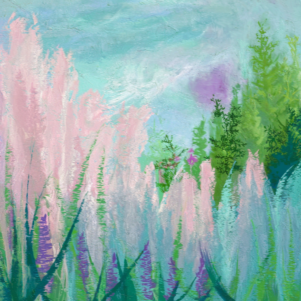
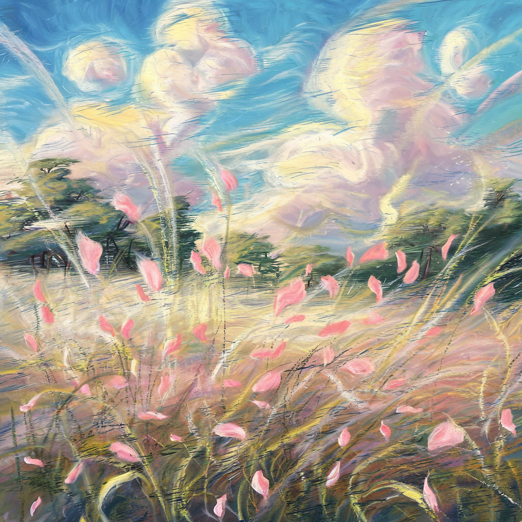

4. Find Inspiration in Nature
- Blossoms: roses, cherry blossoms, tulips.
- Landscapes: meadows and pastel sunsets.
- Wildlife: birds, butterflies, and rabbits.
- Still life: teacups with fresh flowers.
My pick: a nature-inspired sketchbook.


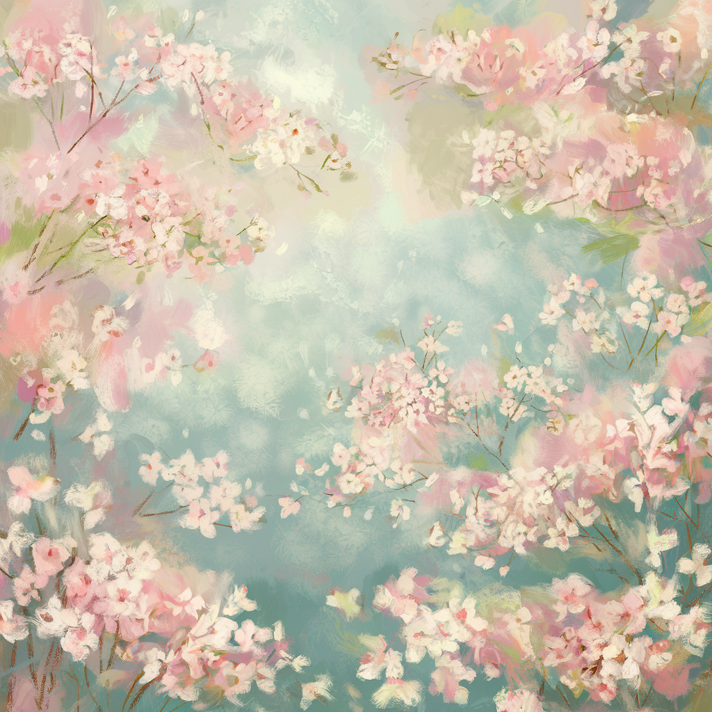

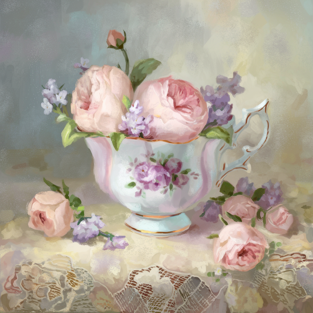
5. Finishing Touches
- Lift highlights with a kneaded eraser for a glow.
- Add white accents to brighten focal points.
- Protect your work with a light coat of fixative.
Tip: spray fixative outdoors or in a well-ventilated space, and tap loose pastel dust away rather than blowing it. See pastel fixative.
For a beginner-friendly walkthrough, watch this tutorial:
Create Your Pastel Spring
With these techniques and a little inspiration, you are ready to capture the softness of spring. Share your art with #PastelSpringArt.

Explore my pastel supply favorites, and follow Artistic Blossom Studio on Pinterest.