This post contains affiliate links. If you buy through them, I may earn a small commission at no extra cost to you.
Your sketches are accurate. The proportions work. And yet something still looks flat, like a coloring page waiting to be filled in.
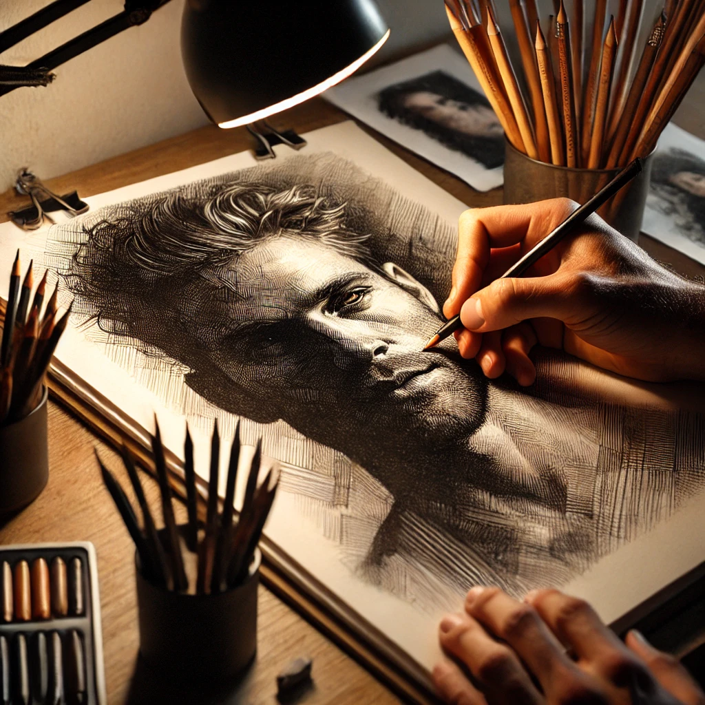
Here’s my point of view: the jump from beginner to advanced sketching is mostly about value, not line. Outlines tell us what something is. Value (how light or dark each area is) tells us it’s real. Every technique below is a different way of controlling value, edges or space, and you’ll get further by practicing one per week than by trying all six on the same drawing.
Quick answer
If you only do one thing, make a 5-step value scale before every drawing session this week, then shade one simple object (an egg, a mug, an apple) under a single lamp. Learning to see five distinct values fixes more flat drawings than any new pencil.
Which technique fixes which problem
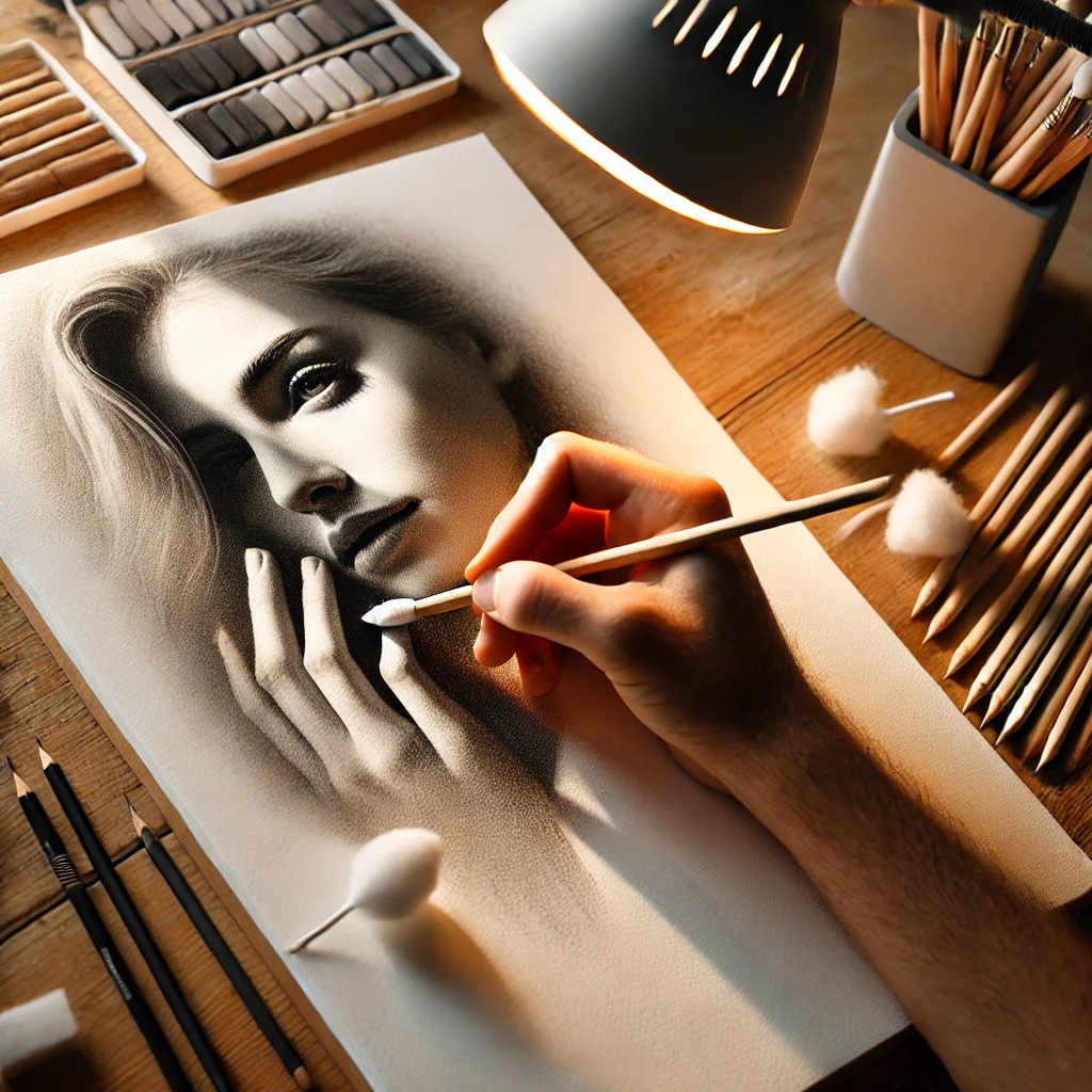
Start with the problem you see most in your own sketchbook.
| If your drawing… | Try this | Why it helps |
|---|---|---|
| Looks flat | Chiaroscuro | Strong light builds form |
| Feels stiff or scratchy | Blending | Softens transitions |
| Has muddy shading | Hatching | Controls value with lines |
| Has wonky proportions | Negative space | You draw shapes, not ideas |
| Looks pasted on the page | Foreshortening | Creates depth toward you |
| Needs texture or sparkle | Sgraffito | Scratches out bright lines |
First, the value scale
Every technique here leans on value, so let’s set up the ruler you’ll measure everything against. Draw five boxes in a row, about 1 inch square. Leave the first one white, fill the last one as dark as your pencil will go, and fill the middle three in even steps.
Use the five values like this:
- Highlight: the brightest spot, often bare paper.
- Light: the lit side of the form.
- Halftone: where the form turns away from the light.
- Core shadow: the darkest band on the object itself.
- Cast shadow and accents: shadows on the surface and the darkest crevices.
Squint at your subject. Squinting blurs details and leaves you with big shapes of value. Ask “is this a 2 or a 3?” for each area, and your shading starts to make sense.
1. Hatching and cross-hatching
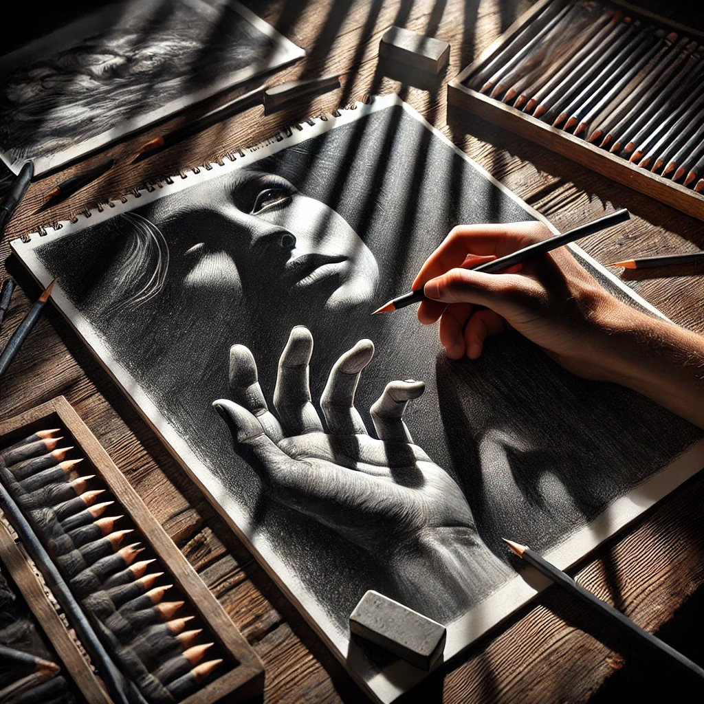
Hatching is a set of parallel lines. Cross-hatching layers another set at an angle. The closer and more layered the lines, the darker the value reads.
How to practice: Fill a row of boxes going from light to dark using lines only. Keep lines the same direction within each layer, and turn the page so your hand moves in its most comfortable arc.
- Vary the line weight: press lightly at each end and a bit harder in the middle for lines that taper.
- Use a range of hardness, like 2H for light passes and 2B to 4B for darks. A tin of Faber-Castell 9000 graphite pencils covers the whole spread.
- Contour hatching (lines that curve around a form) makes a round object read as round.
2. Blending and smudging
Blending smooths graphite or charcoal into soft gradations. It’s lovely for skin, clouds, fabric and anything with a soft edge.
How to practice: Lay down light hatching, then blend with a paper blending stump in small circles. Add another layer and blend again. Two light layers blend more evenly than one heavy one.
- Use stumps or tissue, not fingers. Skin oils leave shiny, blotchy patches that won’t take more graphite.
- Keep a dirty stump for darks and a clean one for light areas.
- Lift highlights back out with a kneaded eraser by pressing and lifting.
Working in charcoal? My guide on how to blend charcoal like a pro covers tools and timing for softer media.
3. Chiaroscuro
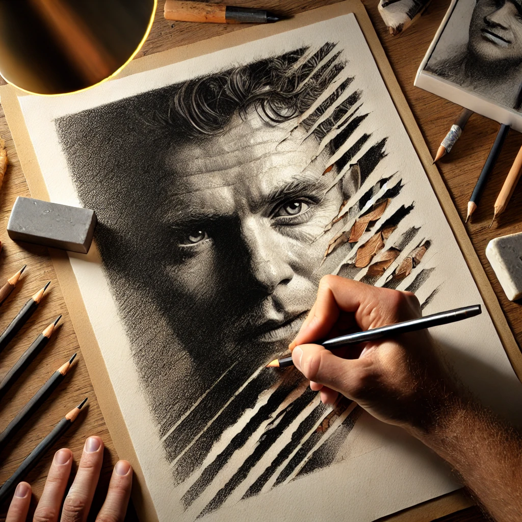
Chiaroscuro is strong contrast between light and dark. It’s the reason old master drawings feel dramatic. The key is one light source. Two lamps, a window plus overhead light, or a bright room all flatten the shadows.
Set up a single desk lamp at about 45 degrees to the side and slightly above your subject, and turn off other lights. Then build the drawing in passes:
- Leave the paper white for the brightest highlights instead of trying to add white later.
- Cast shadows are darkest right where the object touches the surface.
- Reflected light inside a shadow is never as bright as the lit side. Keep it a 3 at most.
For tinted drawings, wax-based colored pencils like Caran d’Ache Luminance layer deep, rich darks that work beautifully for chiaroscuro.
4. Sgraffito
Sgraffito means scratching through a top layer to reveal what’s underneath. In sketching, you build up a thick layer of waxy media, like wax-based colored pencil or oil pastel, then scratch fine lines back out with a needle tool, craft knife, or the tip of an empty ballpoint pen.
How to practice: Lay a light color first, then a heavy dark layer on top. Scratch out whiskers, grass blades, wood grain or hair highlights.
- It works best on smooth, sturdy paper or bristol. Thin paper tears.
- Scratch with the blade nearly flat for broad strokes and on its tip for hairlines.
- Graphite doesn’t build a thick enough layer for true sgraffito. For graphite, indented lines do something similar: press lines into the paper with a stylus first, then shade over them and they stay white.
5. Negative space drawing
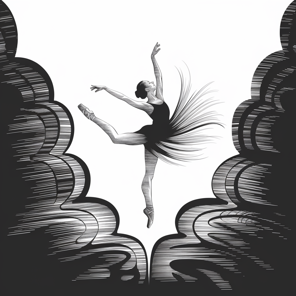
Negative space is the area around and between objects. Drawing those shapes instead of the object itself tricks your brain out of drawing what it thinks a chair or a hand looks like, so proportions get much more accurate.
How to practice: Pick a chair, a plant or your own hand. Draw only the shapes of the gaps: between chair legs, between leaves, between fingers. When the gaps are right, the object appears on its own.
- you draw symbols
- legs get too even
- leaves look copy-pasted
- proportions drift
- you draw what you see
- spacing is accurate
- shapes stay unique
- proportions lock in
A heavier paper like Canson XL Mix Media holds up if you want to fill the negative space with a solid tone or wash afterward.
6. Foreshortening
Foreshortening is what happens when something points toward you: an arm reaching out, a road heading into the distance, a flower facing your eyes. It looks shorter than you expect, and the part closest to you looks bigger.
How to practice: Build the form from simple overlapping shapes. A foreshortened arm is a stack of cylinders and ovals, with the nearest one largest and overlapping the next.
- Overlap is your strongest depth cue. Whatever is closer covers what’s behind it.
- Measure with your pencil at arm’s length, and trust the measurement over your expectations.
- A fine mechanical pencil like the Pentel GraphGear 1000 keeps construction lines light and precise.
Your 6-week practice plan
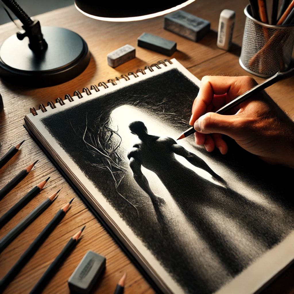
One technique per week, about 20 to 30 minutes a day. That’s roughly 3 hours per skill, enough to feel a real difference without burning out.
| Week | Technique | Daily exercise | End-of-week drawing |
|---|---|---|---|
| 1 | Hatching | Value boxes in lines only | A mug in hatching |
| 2 | Blending | Smooth gradient strips | A soft fabric fold |
| 3 | Chiaroscuro | Egg under one lamp | A still life, dramatic light |
| 4 | Sgraffito | Scratch-out swatches | Tree bark or fur |
| 5 | Negative space | Gaps of a chair or plant | A houseplant |
| 6 | Foreshortening | Cylinder stacks | Your own hand reaching out |
Date every page. At the end of week 6, put your week 1 mug next to your week 6 hand. Seeing the difference is the best motivation there is.
If you want a gentler ramp first, my 30-day sketching challenge builds the daily habit with shorter prompts.
Investment pieces worth it
You can learn every technique above with a few graphite pencils, a stump and a kneaded eraser. These are the upgrades that make a noticeable difference once you’re drawing several times a week.
Caran d’Ache Luminance 40
- Caran d’Ache Luminance 40-color set, around $170 at the time of writing.
Highly lightfast, wax-based and very creamy. Great for chiaroscuro and sgraffito in color.
Worth it for: artists who already love colored pencil and want archival, layer-friendly color. Skip it if: you mostly sketch in graphite. Spend that money on paper and a lamp first.
Faber-Castell Polychromos 120
- Faber-Castell Polychromos 120 tin, around $295.
Oil-based, firmer than Luminance and holds a sharp point, which makes them excellent for hatching in color. Over 3 years of weekly sessions that’s under $2 a session.
Worth it for: detailed colored pencil work, botanicals and fine hatching. Skip it if: you’re unsure colored pencil is your medium. Try a small set or open stock first.
Daylight Lumi Task Lamp
- Daylight Company Lumi Task Lamp, around $195, with a 95+ CRI rating.
Chiaroscuro depends on one clean, directional light. A lamp you can angle and position the same way every session makes value practice far more consistent.
Worth it for: anyone who draws in the evening or in a room with poor light. Skip it if: you have a bright north-facing window and draw in daytime.
A tilting drafting table
- Studio Designs Vintage Drafting Table, around $270, solid wood.
Drawing flat on a table distorts proportions because you see the top of the page at an angle. A tilted surface keeps the whole drawing square to your eyes, and your neck will thank you.
Worth it for: long sessions and anyone fighting proportion drift. Skip it if: space is tight. A tabletop easel or a board propped on books gets you most of the benefit.
The takeaway
Advanced sketching is mostly about learning to see and control value, edges and space. Make a value scale, use one light, and practice one technique per week. Six weeks from now, your sketches will have real depth.
Which technique do you want to work on first? Tell me in the comments.
Save this plan so you can follow it week by week.