This post contains affiliate links. If you buy through them, I may earn a small commission at no extra cost to you.
Ever painted one wall a color you loved, added a few bright pieces, and somehow ended up with a room that feels loud instead of happy?

Here’s my take: a colorful studio works when one color is the boss. Pick a single anchor color, give it a supporting cast and a calm base, and you can go as bright as you like. When five colors all compete for attention, the room starts to feel busy, and so does your head.
So this post starts with the palette, then gives you ten ways to put it into the room, from a $40 can of paint to a rug that ties everything together.
If you only do one thing: choose one anchor color you’d happily look at every day (coral, teal, mustard, cobalt or emerald) and repeat it in three places across the room. Three repeats is what makes a bold color look planned.
Start Here: Three Palettes You Can Borrow
These are three palette families that suit art studios well. Each has an anchor, a partner and a pop. Use the hex codes when you shop for paint, bins or prints so everything actually matches.
- Bold and bright suits fast, expressive work and anyone who loves high energy. A swap that also works: orange, hot pink and teal.
- Soft and playful suits watercolor, illustration and smaller rooms. Swap in baby blue, coral or blush if you prefer.
- Earthy but colorful suits anyone who wants warmth without neon. Olive, rust and cyan is a lovely variation.
How a color makes you feel is personal, so trust your gut over any chart. If a color makes you smile on a gray Tuesday morning, it’s a good studio color.
The 60-30-10 Rule (Your Safety Net)

Interior designers use a simple ratio to keep color from tipping into chaos. It works beautifully in studios.
The base should be a quiet neutral: warm white, soft gray, cream or natural wood. That’s the part that keeps your eye rested while you judge color in your own work.
New to building palettes? The Ultimate Color Palette Guide for Artists walks through color harmony step by step.
Pick Your Anchor Color
Here’s how the most popular anchor colors behave in a studio, and what to pair them with.
| Anchor | Pairs with | Base | Feels |
|---|---|---|---|
| Coral | teal, cream | warm white | cheerful |
| Teal | coral, mustard | soft gray | fresh |
| Mustard | cobalt, rust | cream | sunny |
| Cobalt | orange, blush | white | crisp |
| Emerald | pink, gold | warm white | rich |
10 Colorful Studio Decor Ideas
Here’s every idea at a glance, so you can start with the cheapest, biggest wins.
| Idea | Cost | Time | Impact |
|---|---|---|---|
| Anchor color in storage | $ | 1 hour | high |
| Statement wall | $$ | 1 day | high |
| Washable rug | $$ | 10 min | high |
| Painted furniture piece | $ | 1 afternoon | medium |
| Gallery of your art | $ | 2 hours | medium |
| Daylight work lamp | $$$ | 10 min | high |
| DIY planters and mats | $ | 1 afternoon | low |
1. Choose One Anchor Color
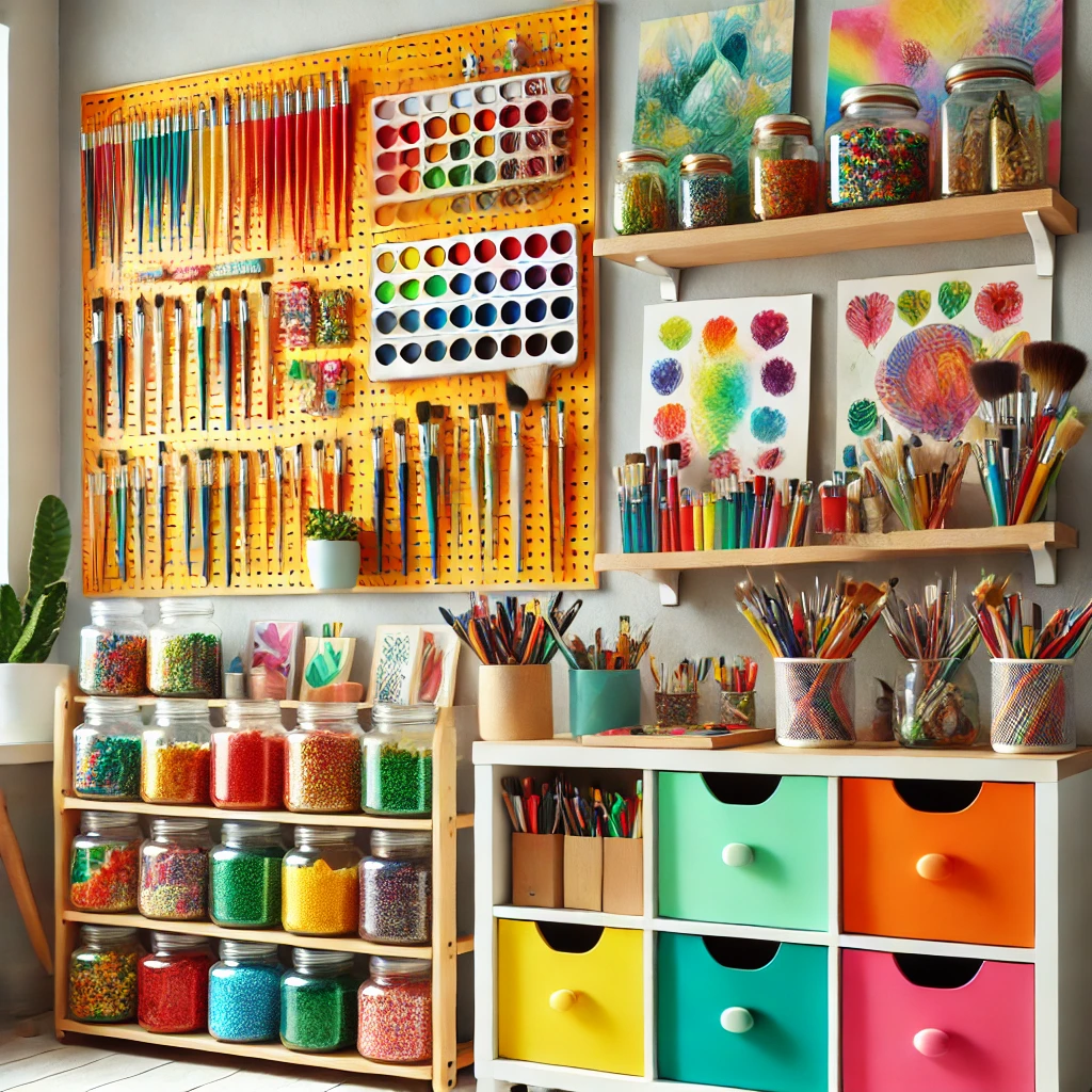
You’ve done this already if you used the table above. Now commit: the anchor shows up in your storage, one piece of furniture and at least one textile.

| 
| 
| 
|
$11.69
| $51.00
| $37.97
| $27.99
|
The pieces in that table (a rotating pen holder, an orange metal pegboard, a turquoise cart, fabric cubes) are easy ways to place your anchor color without repainting anything.
2. Keep the Base Neutral
Walls in warm white or soft gray make every bright accent look intentional. They also matter for your art: a saturated wall reflects tinted light onto your paper, which can skew how you mix colors.
- Keep the wall directly behind your easel or desk neutral.
- Put the color on walls you don’t face while you work.
3. Add a Statement Wall
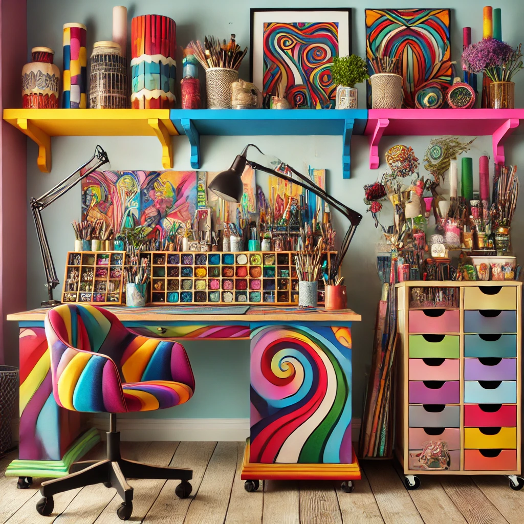
One wall can carry the whole personality of the room. Pick the wall you see from the doorway.
- Paint: a gallon covers about 350-400 square feet, plenty for one wall, for around $40-$60.
- Peel-and-stick wallpaper: renter-friendly and removable.
- Mural: a simple geometric pattern with painter’s tape takes an afternoon.
- Gallery wall: your own work in mismatched frames painted one color.
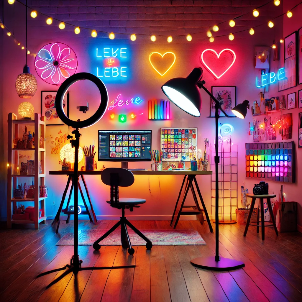
- Neon sign: a small LED word or shape adds glow without paint.
4. Put Color Into Your Storage
Storage is the easiest place for color because you need it anyway. Colored carts, bins and pegboards do double duty.
Sort supplies into bins by color family and you get a rainbow display that also tells you exactly where the ultramarine lives.
More ideas in Aesthetic Art Supply Storage Ideas.
5. Choose Furniture With Personality
One painted piece is enough. A thrifted dresser in mustard or a stool in teal reads as a happy surprise. Five painted pieces read as a theme park.
Chalk paint sticks to most wood with a light scuff sand and no primer, so a small side table is a one-afternoon project.
6. Ground It All With a Rug
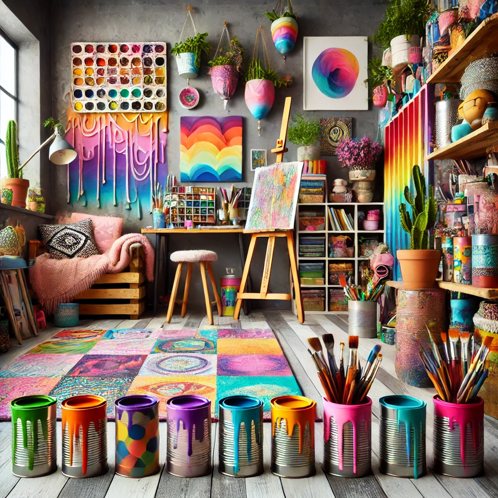
A rug is the 30% layer you can stand on. It pulls the anchor color down to the floor so the room feels finished instead of top-heavy.
Best Aesthetic Impact 
|
Budget-Friendly 
|
Elevated Studio Vibe 
|
$116.95
| $69.88
| $90.07
|
Washable rugs are worth it in a studio. Paint drips happen, and being able to toss the rug in the wash takes the worry out of working on the floor.
Size your rug so the front legs of your desk or easel sit on it. A 5×7 rug works for most single-desk studios. A 3×5 can look like a floating postage stamp.
7. Display Your Own Art
Your work is the most personal color in the room. Rotate pieces every season so the walls never go stale.
- Hang the center of each piece about 57 inches from the floor.
- Use a picture ledge for easy swapping.
- Frame small studies in the same color frame so a busy wall still looks unified.
8. Light It Right
Color only looks as good as the light on it. You need two kinds:
- Work light: daylight bulbs around 5000K with a CRI of 90 or higher, so the colors you mix look true.
- Mood light: warm fairy lights or a small lamp at about 2700K for evenings and photos.
Keep the warm lights out of your work zone so they don’t tint your palette. A ring light is handy if you film or photograph your process.
See The Best Lighting for Art Studios for bulbs and lamps by budget.
9. Balance Color With Structure
Bright rooms need order to feel calm. Matching containers, straight shelf lines and clear surfaces let the color shine instead of competing with clutter.
- one anchor color
- neutral wall behind easel
- matching bins
- repeat color three times
- five equal colors
- bright wall you face
- mismatched containers
- color in one corner only
10. Add DIY Flair
Small handmade touches are where your studio starts to look like you.
- Paint a canvas floor mat in your palette (it also catches drips).
- Drip-paint terracotta planters in your anchor and pop colors.
- Wrap tin cans in painted paper for brush holders.
- Arrange art books by spine color for a free rainbow shelf.
Small Studio? Go Bold in Smaller Doses
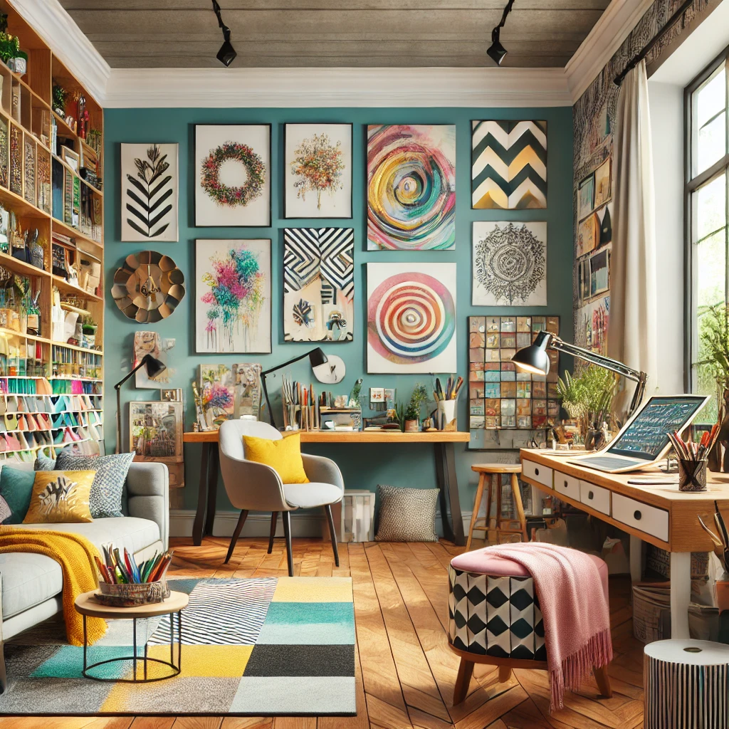
You can absolutely do color in a small room. Keep walls light and put the color on things you can move: a cart, bins, a rug, framed prints. Painting the inside of a bookcase back is a fun trick that adds color without closing in the room.
Investment Pieces Worth It
Once your palette is set, these are the pieces that make a colorful studio feel permanent. Pick one, not all three.
Wall Control Metal Pegboard (around $40-$60). Steel pegboard comes in bright colors and holds far more weight than hardboard, so it can be both your color moment and your tool wall. Worth it if you want storage that doubles as decor. Skip it if you rent and can’t drill into studs.
Daylight Company Anita Floor Lamp (around $245). A 95+ CRI floor lamp that keeps your colors honest at night. Over three years of painting twice a week, that’s about $0.80 a session. Worth it if you paint after dark. Skip it if your studio gets strong north light and you only work by day.
Loon Peak Ilkan Solid Wood Floating Shelf. A solid wood shelf is a warm, neutral stage for colorful jars, books and small paintings. Worth it if you want a display spot that balances a bright wall. Skip it if your wall space is already full.
Colorful Studio Decor FAQ
Will a bright studio affect how I see color in my work? It can. Keep the wall you face while working neutral and use 5000K daylight bulbs at your desk.
How many colors is too many? Three main colors plus neutrals and wood is a comfortable limit. Beyond that, keep extras to small accents.
What’s the cheapest way to add color? Painted storage and textiles. A can of spray paint and a set of fabric cubes can change a room for under $50.
Can I mix bold and soft palettes? Yes. Use the soft palette as your 60% and 30%, then let one bold color be your 10% pop.
The Takeaway
A colorful studio feels joyful when one anchor color leads and a calm base lets it shine. Pick your palette, follow 60-30-10, and add color through storage and textiles before you reach for the paint roller.
Which palette is calling your name: bold, soft or earthy? Tell me in the comments, and save this pin for your next studio refresh.
Keep going: