This post contains affiliate links. If you buy through them, I may earn a small commission at no extra cost to you.
Ever mixed a dozen gorgeous colors, put them all in one painting, and ended up with something that felt loud and strangely flat?
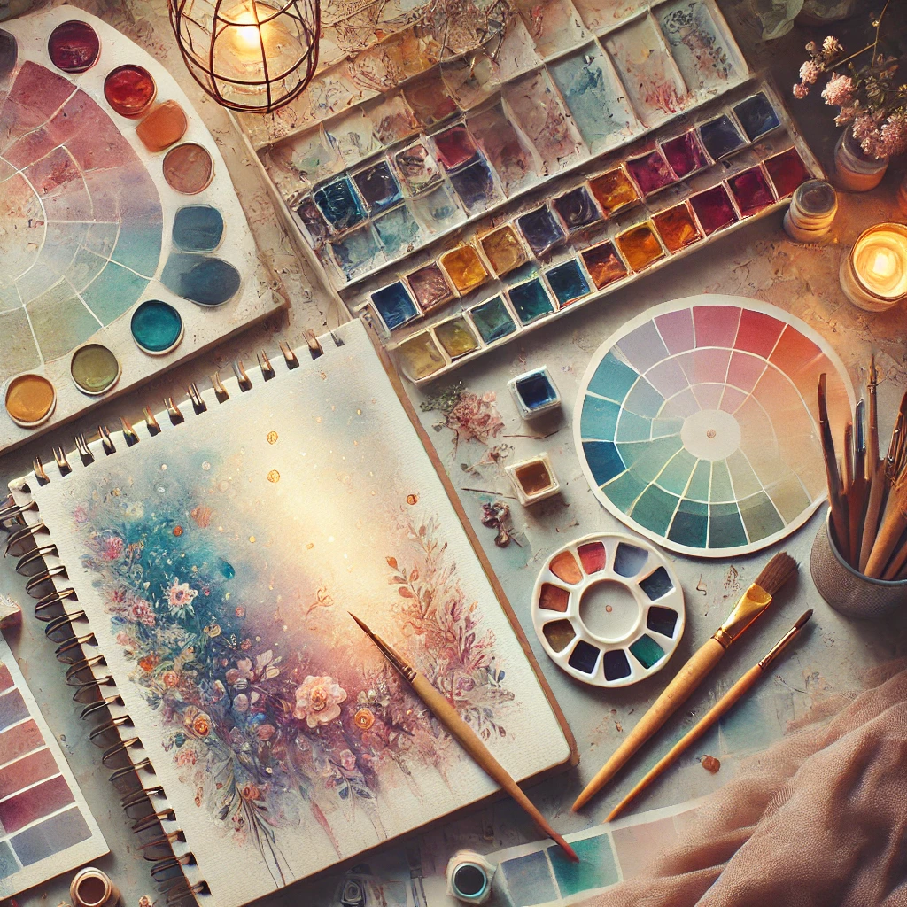
Here’s my take: great color palettes are mostly about leaving colors out. Three to five hues, one clear boss color, and a real range from light to dark will beat a full 24-color set every time. The restraint is what makes the color sing.
Below you’ll find five ready-to-use palettes with hex swatches, a cheat sheet for color schemes, and the simple checks I use before committing a palette to a canvas.
If you only do one thing: pick one dominant color, one supporting color and one small accent, then paint a quick swatch strip before you start. If the strip makes you happy, the painting will too.
How Color Sets the Mood
Before you choose hues, decide how you want someone to feel when they look at the finished piece. Color does most of that work before they even notice the subject.
- Warm colors (reds, oranges, yellows) feel energetic, cozy and close. They seem to step forward in a painting.
- Cool colors (blues, greens, violets) feel calm, quiet and distant. They tend to recede, which is why far mountains look blue.
- Neutrals (grays, beiges, browns) give the eye a place to rest and make the bright colors around them glow.
A color wheel is the easiest way to see these relationships at a glance. Keep one taped near your palette.
Color Scheme Cheat Sheet
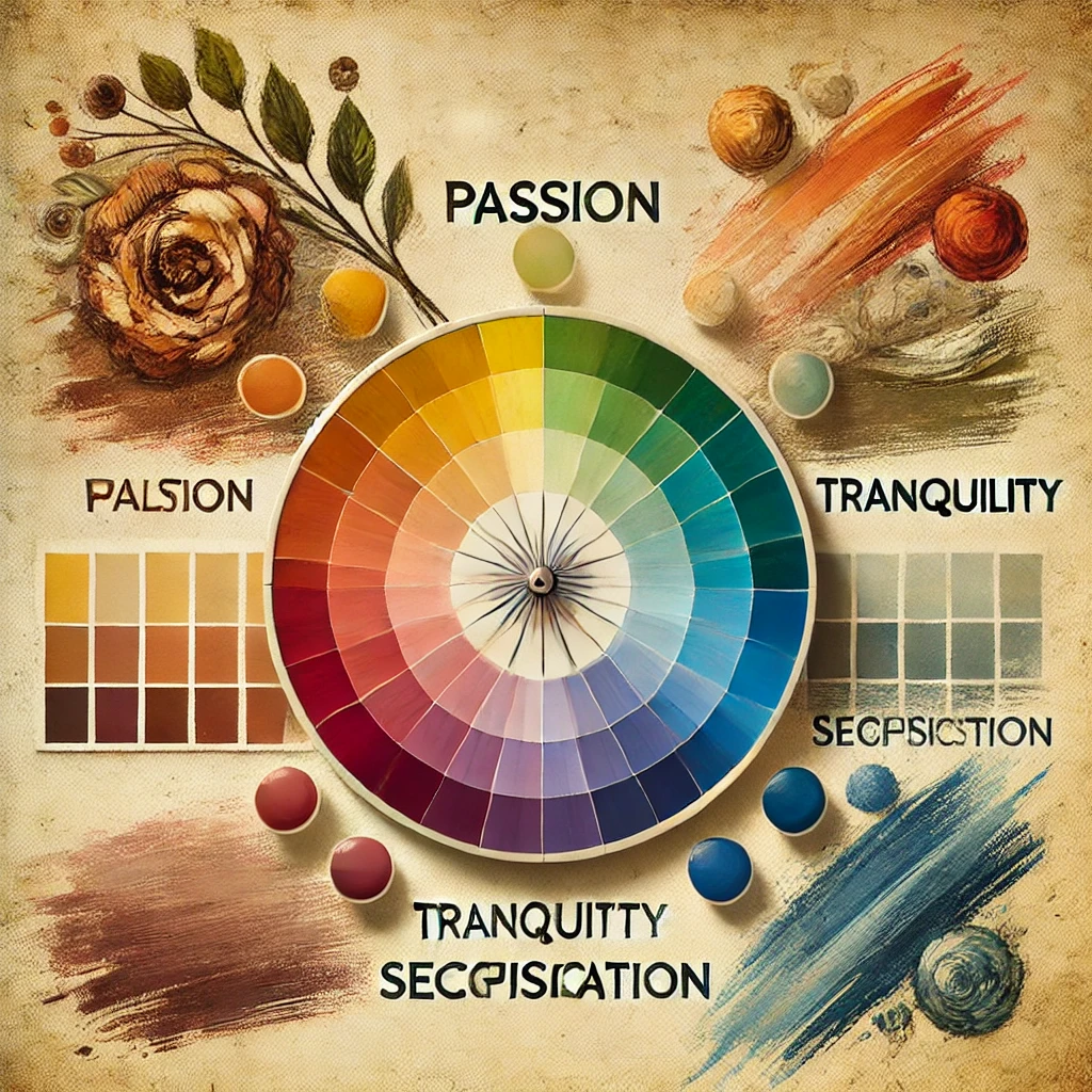
Every palette below is built on one of these classic relationships. Once you know them, you can build your own in minutes.
| Scheme | How it works | Feel | Try it with |
|---|---|---|---|
| Monochrome | one hue, many values | calm, elegant | blue misty landscape |
| Analogous | 3 neighbors on the wheel | harmonious | autumn leaves |
| Complementary | 2 opposites | bold, punchy | orange sun, blue sky |
| Split-complementary | 1 hue + 2 beside its opposite | lively but balanced | violet florals, yellow-green leaves |
| Triadic | 3 evenly spaced hues | playful | folk-style still life |
If you’re new to color, start with analogous. It’s hard to make it look bad.
5 Dreamy Palettes to Paint With
Hex codes here are approximate screen matches. Use them for digital sketches, mood boards and shopping, then mix the real thing from your paints and adjust by eye.
1. Sunset Glow
Burnt orange, blush, golden yellow and soft violet. This is an analogous warm palette with a cool violet added for shadows, which keeps it from feeling flat.
Great for skies, desert scenes and warm florals. An acrylic sunset set gets you close straight out of the tube.
2. Celestial Dream
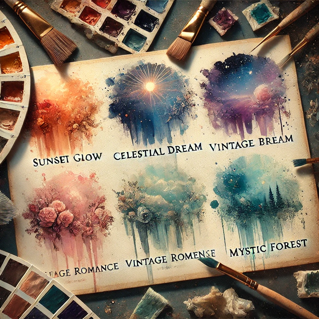
Midnight blue, lavender, silver and soft teal. Cool, quiet and a little magical.
Perfect for night skies, moonlit water and fantasy pieces. A metallic and pastel watercolor set gives you real shimmer for the silver, which no mixed gray can match.
3. Vintage Romance
Dusty rose, sage, warm beige and cream. Every color is softened with a touch of gray or brown, which gives it that old-letter, faded-wallpaper charm.
Lovely for florals, still lifes and soft portraits. A soft blending brush helps these low-contrast colors melt into each other. If you love this mood in a room too, see my vintage art room color scheme.
4. Ocean Breeze
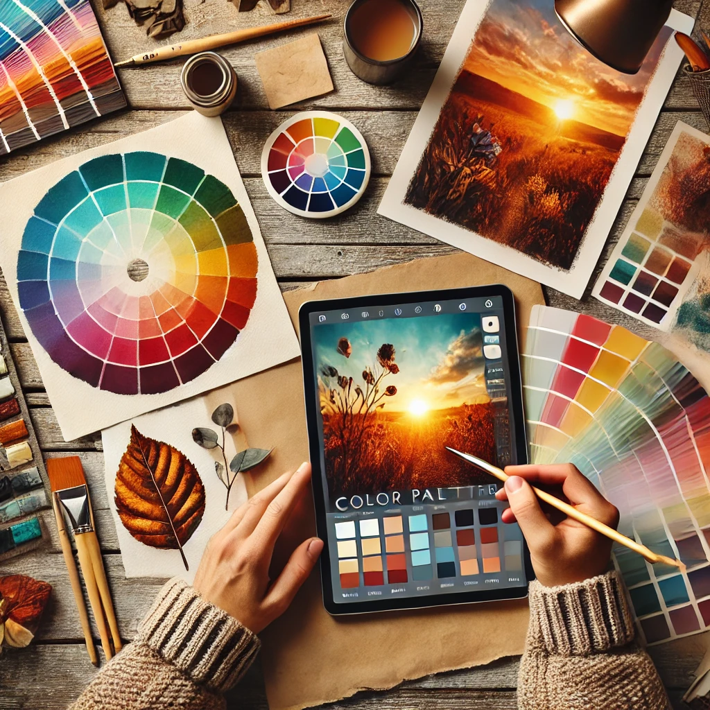
Deep teal, seafoam, sand and pale blue. Cool blues and greens with one warm neutral, so the sand makes the water look even wetter.
Made for beaches, waves and coastal landscapes. An oil paint set is wonderful here because you can blend wave edges slowly.
5. Mystic Forest
Moss green, warm brown, deep plum and golden ochre. Rich and earthy, with plum doing the shadow work instead of black.
Beautiful for woodland scenes, mushrooms and moody botanicals. An earthy pigment set has these grounded tones ready to go.
Balance It With the 60-30-10 Rule
A palette is only half the job. How much of each color you use matters just as much. Equal amounts of four colors make a painting feel busy, because nothing leads.
In Sunset Glow, that might be 60% burnt orange in the sky, 30% violet in the clouds and shadows, and 10% golden yellow right around the sun. Notice how the smallest color gets the most attention. That’s the accent doing its job.
How to Choose Your Own Palette
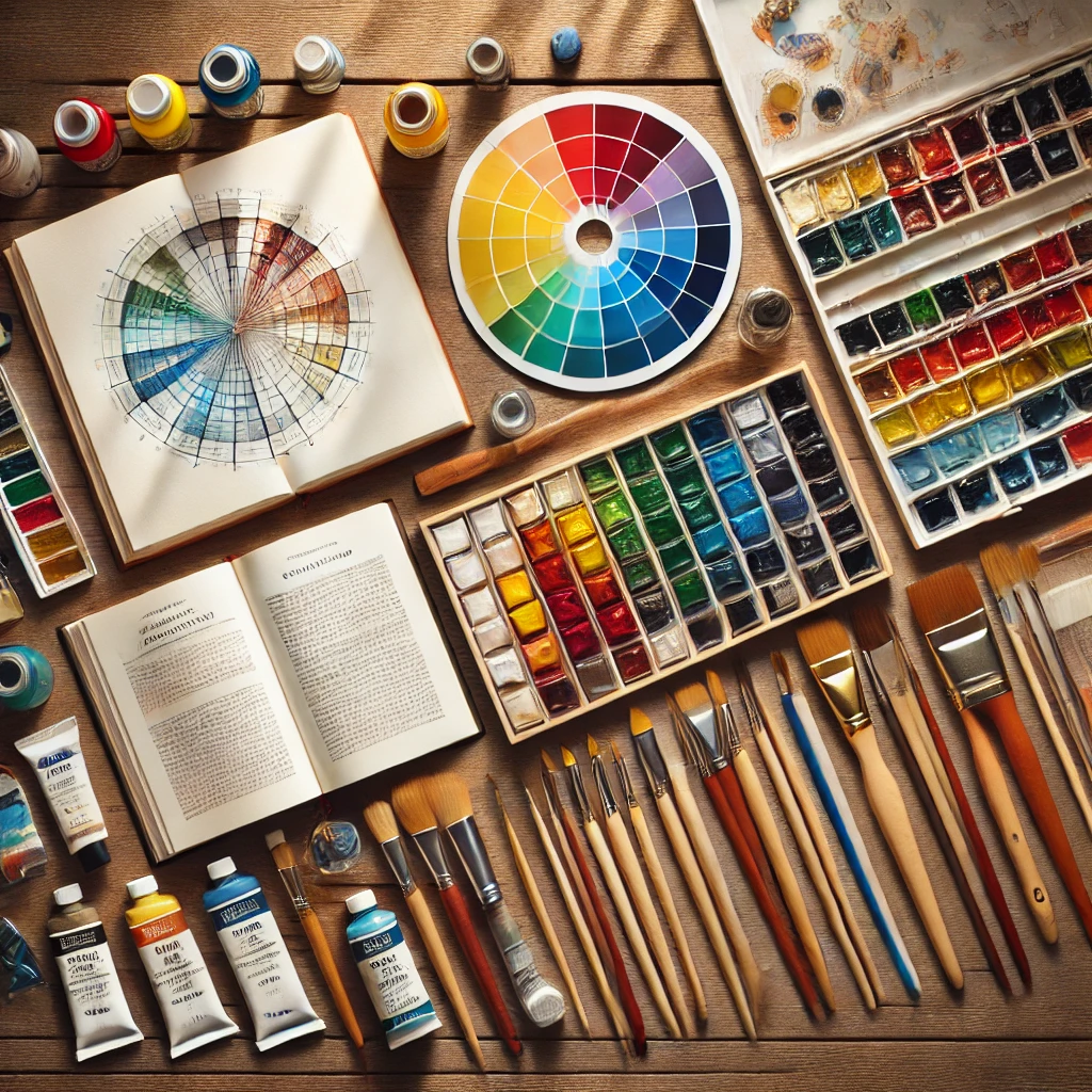
When none of the five above fit, build your own with this short routine.
- Start with the mood. Pick three words for how the painting should feel (“quiet, cold, early”) before you pick a single color.
- Pull from real life. Photos of nature, old textiles and even a favorite mug are full of tested color combinations. A mood board makes this easy to collect.
- Try a palette generator. Free tools like Adobe Color and Coolors let you lock one color you love and see what goes with it.
- Limit it. Three to five colors, plus white. More than that and you’re back to busy.
- Swatch first. Paint a strip of each color plus a few mixes on scrap paper. Ten minutes here saves hours of fixing later.
A digital color guide is handy if you sketch on a tablet first.
The value check most people skip
Color gets the credit, but value (how light or dark a color is) does the heavy lifting. A palette of five colors that are all the same value will look flat no matter how pretty they are.
Squint at your swatch strip until the colors blur. Or snap a photo and switch it to black and white. You want at least one clear light, one middle and one dark. If everything turns the same gray, swap one color for a deeper or paler version.
Mixing a Limited Palette: Warm and Cool Primaries
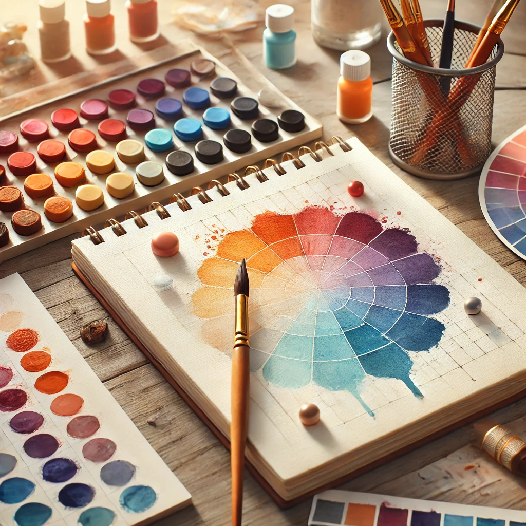
If you want one palette that can mix almost anything, use a warm and a cool version of each primary. Six tubes, endless color, and clean mixes because you’re not fighting the wrong bias.
| Primary | Warm version | Cool version | Mixes cleanly into |
|---|---|---|---|
| Yellow | cadmium yellow | lemon yellow | warm: oranges. cool: greens |
| Red | cadmium red | quinacridone rose | warm: oranges. cool: violets |
| Blue | ultramarine | phthalo blue | warm: violets. cool: greens |
The trick: mix two colors that lean toward each other. Lemon yellow and phthalo blue make a bright green. Cadmium yellow and ultramarine make a softer, olive green, which is perfect for the Mystic Forest palette.
Paints and Brushes for Each Medium
Any of these palettes works in any medium. Each one gives a different finish.
- Gouache: flat, velvety, opaque color that’s great for illustration. Try a gouache set.
- Acrylic: fast drying and forgiving. Choose a matte acrylic set for soft vintage palettes or gloss acrylics for jewel tones like Celestial Dream.
- Watercolor: luminous and airy. A watercolor set or a watercolor supply kit covers the basics.
- Brushes: fine detail brushes for accents and a mop brush for big soft washes.
For deeper reading, Color and Light by James Gurney is one of the clearest books on how color behaves in real light.
Investment Pieces Worth It
Most of the color magic happens on a budget. These are the two upgrades that show up on the canvas.
A professional watercolor set. The Schmincke Horadam 24 half-pan box (around $157) or the Winsor & Newton Professional travel tin (around $143) gives you strong, mostly single-pigment colors, so limited palette mixes stay clean instead of going gray. Painting once a week for three years, $150 is under $1 a session. Worth it if you paint regularly and mix a lot. Skip it if you’re still testing mediums.
A gorgeous colored pencil set for palette planning. Faber-Castell Polychromos 120 (around $295) is a luxury, but 120 lightfast, oil-based colors make fast palette sketches easy before you open a single tube. Worth it if you also draw. Skip it if you only paint. Your swatch strips do the same job for free.
Want the full theory behind these palettes? Read the ultimate color palette guide for artists, then try one palette with my watercolor techniques for ethereal paintings.
The Takeaway
The best palettes are small, have one clear boss color, and cover light, middle and dark values. Pick a mood, choose three to five colors, swatch them, and squint before you commit.
Which of the five palettes would you paint first: Sunset Glow or Mystic Forest? Tell me in the comments. And save this to your color inspiration board so the swatches are ready when you need them.
Keep going: