This post contains affiliate links. If you buy through them, I may earn a small commission at no extra cost to you.
Ever fall in love with a moody vintage paint chip, then worry it will turn every painting you make a little brown?

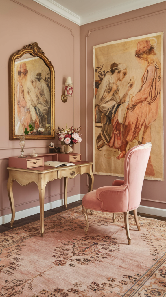
Here’s my take: a vintage art room color scheme works when the walls carry the mood and the light at your easel stays neutral. Pick one scheme, commit to it on the walls and wood, and keep a daylight lamp aimed at your work. That one split lets you have the dusty rose walls or the deep burgundy library and still mix colors you can trust.
Below are seven vintage schemes, each with its colors, the wood and metal that suit it, and the furniture that pulls it together.
If you only do one thing: choose your wall color, then match just two more things to it, your wood tone and one metal finish. Wall, wood and metal are the three choices that make a room read “vintage.” Everything else is accessories.
The 7 Schemes at a Glance

Hex codes are approximate screen matches. Use them to shop textiles, frames and prints, then test real paint samples on your own walls.
| Scheme | Walls | Wood | Metal |
|---|---|---|---|
| Antique Rose | blush or taupe | pale painted wood | aged gold |
| Sepia | parchment | rustic pine | dark iron |
| Dusty Blue | soft blue | white painted | aged silver |
| Olive | deep olive | walnut | brass |
| Lavender | faded lilac | cream painted | pewter |
| Burgundy | wine red | mahogany | antique brass |
| Golden Ochre | warm ochre | dark oak | aged bronze |
How to Use Any Vintage Palette: The 60-30-10 Split

Vintage rooms tip into “antique shop” when every surface is a statement. Give each color a share instead.
In an art room, I’d keep the 10% accents off your work surface entirely. A brass tray on a shelf is lovely. A brass tray reflecting a hot spot onto your paper is not.
1. Antique Rose and Warm Neutrals

The mood: a Parisian loft with afternoon light, soft and romantic without being sugary.
The colors: blush pink, warm taupe, cream and aged gold. Blush on the walls, cream on the trim, gold in small doses.
Furniture and decor:
- A painted cream desk or a pale wood drafting table
- Gilded frames in mixed sizes for a gallery wall of your sketches
- Linen curtains in cream or oatmeal to soften the light
- A velvet accent chair in dusty rose or mink
Blush walls cast a faint pink glow, so this scheme especially needs a neutral lamp at the desk. Keep warm, cozy bulbs for the rest of the room.
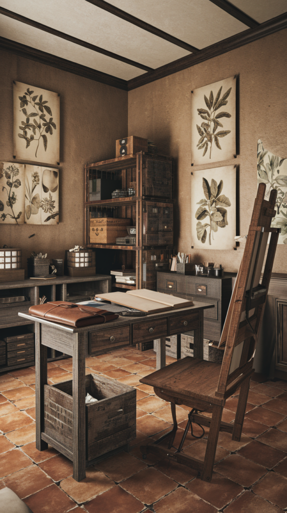
2. Sepia Tones and Aged Wood

The mood: a rustic atelier that smells like linseed oil and old paper.
The colors: burnt sienna, espresso brown, parchment and terracotta. Parchment walls keep it from feeling cave-like.
Furniture and decor:
- A heavy wood worktable with visible grain and a few honest dings
- Open shelves holding jars of brushes and stacks of sketchbooks
- Edison-style bulbs in pendants or wall sconces
- Terracotta pots for brushes and pencils
Edison bulbs usually run around 2200K, very warm and amber. They’re perfect for mood and terrible for judging color, so use them for ambience only. If you want your wood to look properly aged, my guide to staining wood for a vintage look walks through it.
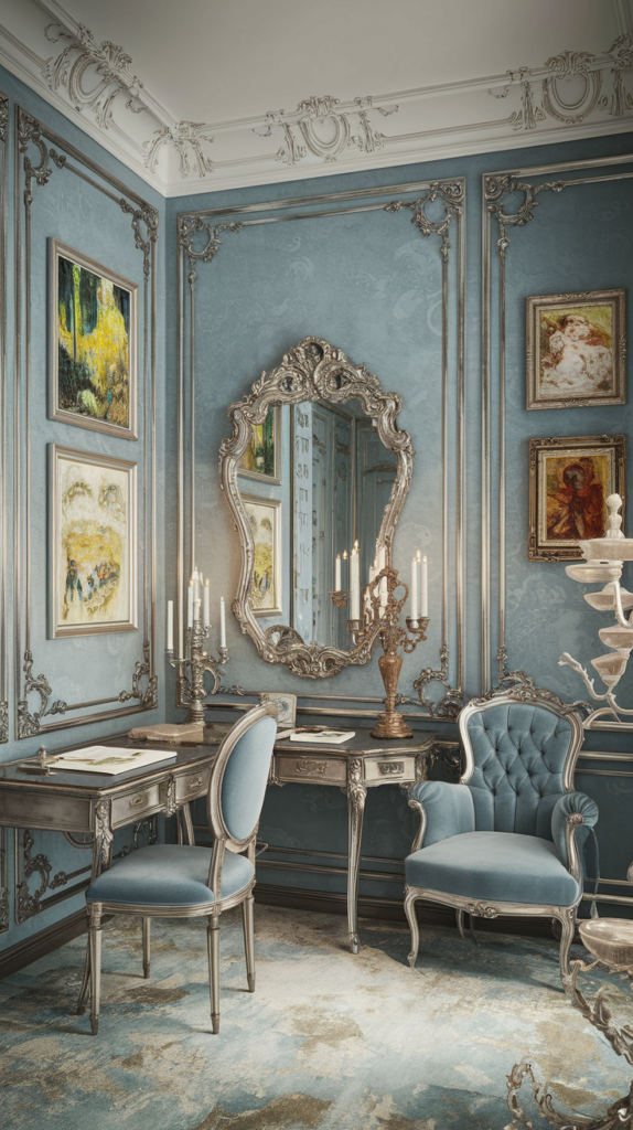
3. Dusty Blue and Aged Silver

The mood: an old French salon, calm and a little elegant.
The colors: dusty blue, soft gray, white and aged silver. Of all seven, this is the friendliest scheme for painting, because cool, muted blue walls barely tint what you see.
Furniture and decor:
- A painted French-style writing desk, like this blue French writing desk
- Silver or pewter mirror frames to bounce light around
- White ceramic jars for brushes
- A gray or blue upholstered chair with turned legs
A large silver-framed mirror across from a window can make a small blue room feel noticeably brighter. Just angle it so it doesn’t throw glare onto your easel.
4. Olive Green and Brass


The mood: an old-world library where someone also paints.
The colors: deep olive, warm brass, walnut brown and cream. Sherwin-Williams Ripe Olive is a classic pick for this look.
Furniture and decor:
- A dark wood writing desk, such as this walnut writing desk
- Brass desk lamps, drawer pulls and picture lights
- Leather-bound sketchbooks lined up on shelves
- Botanical prints in dark frames
Deep olive walls absorb a lot of light. Plan on more lamps than you think, and paint the ceiling a warm white to keep the room from closing in.
5. Vintage Lavender and Cream

The mood: a cottage studio with a garden outside the window.
The colors: faded lilac, soft cream, sage and a touch of pewter.
Furniture and decor:
- Peel-and-stick floral wallpaper on one wall (easy to remove later)
- Mismatched vintage teacups for holding brushes and pencils
- A cream painted dresser for paper and supplies
- Lace or sheer cotton curtains
Lavender is a gentle choice for an accent wall rather than all four. Put it behind your desk, not behind your easel, so it stays out of your peripheral color judgment.
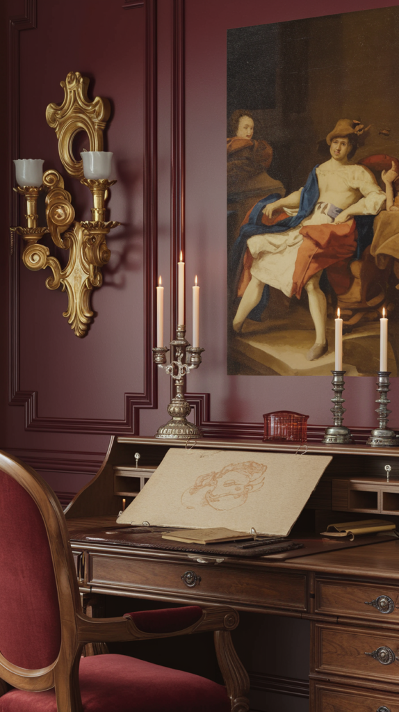
6. Deep Burgundy and Mahogany


The mood: a Victorian study, rich, dark and dramatic.
The colors: wine red, mahogany, antique brass and deep cream. Farrow and Ball Brinjal is a gorgeous dark aubergine for this look.
Furniture and decor:
- A rolltop or partners desk in mahogany
- Velvet drapes in burgundy or deep green
- Antique brass candlesticks and picture lights
- Gilded frames on a dark wall, which makes artwork glow
Love the candle glow? Keep any real flame well away from drapery, paper stacks and solvent rags, and never leave one burning in an empty room. Battery candles give 90% of the look with zero risk.
This is the hardest scheme for color accuracy. Dark red walls bounce warm, reddish light onto everything, so a high-CRI daylight lamp at the work surface is not optional here.
7. Golden Ochre and Burnt Umber

The mood: a Renaissance painter’s studio, warm and earthy with a sense of history.
The colors: golden ochre, burnt umber, raw sienna and parchment. These are earth pigments painters have used for centuries, so the palette feels right at home in an art room.
Furniture and decor:
- An apothecary-style cabinet with lots of small drawers for pigments, pencils and pastels
- A dark oak table or easel
- Plaster busts or still-life objects on a shelf
- Old maps or anatomy studies in simple frames
Apothecary drawers are as practical as they are pretty. Shallow drawers around 2 to 3 inches deep keep tubes and pencils in a single layer where you can see them.
Lighting: Warm Walls, Neutral Work Light

Every vintage scheme looks best under warm light. Every painting is judged best under neutral daylight. The fix is two layers.
| Light layer | Color temp | CRI | Job |
|---|---|---|---|
| Ambient (sconces, pendants) | 2700 to 3000K | 80+ | mood |
| Edison accents | about 2200K | any | glow only |
| Task light at easel or desk | 5000K | 90 to 95+ | true color |
Point the daylight lamp at your work, not at the walls, so the room keeps its vintage warmth. For lamp picks and placement, see the best lighting for art studios.
Test Your Paint Before You Commit

Vintage colors are tricky. Dusty blue can read gray at noon, and burgundy can look nearly black at night. Spend a week testing before you buy gallons.
The art test is the one people skip. Hold a painting you love against the sample. If the wall makes it look muddy or washed out, keep looking.
Investment Pieces Worth It

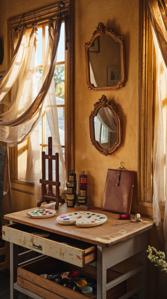
A few higher-ticket pieces do more for a vintage room than a dozen small accessories. Here are the ones I’d consider.
Studio Designs Vintage Drafting Table, Solid Wood (around $270). A tilting wood top with the look of an old architect’s table, and it suits the sepia, olive and ochre schemes especially well. Worth it if you draw several times a week and want your main piece to set the vintage tone. Skip it if you mostly paint large canvases at an easel. Used weekly for 3 years, it works out to under $2 a session.
Williston Forge Hackett Reclaimed Teak Drafting Table. Reclaimed teak brings real age and character that new wood can’t fake. Worth it if you want a statement piece for a sepia or ochre room. Skip it if your scheme is light and airy, like antique rose or lavender, where painted wood fits better.
Daylight Company Lumi Task Lamp, 95+ CRI (around $195). This is the piece that makes the darker schemes workable. Worth it if you chose burgundy, olive or sepia walls. Skip it if your work area gets steady north light and you only paint during the day.
Sauder Craft and Sewing Armoire, Mystic Oak (around $525). Warm oak doors hide a whole studio of supplies, which keeps the vintage look clean. Worth it if your art room doubles as a guest room or office. Skip it if you already have a closet you can fit with shelves.
Vintage Art Room Color FAQ

What is the best vintage color for an art room? Dusty blue is the easiest to paint in, because cool muted walls tint your work the least. Burgundy and olive are the most dramatic but need strong task lighting.
Can I mix two vintage schemes? Yes, if they share a wood tone. Olive and ochre both love dark oak and brass, so they combine nicely.
Should the ceiling match? Usually no. A warm white or cream ceiling reflects more light and stops dark walls from feeling heavy.
How do I keep a vintage room from looking cluttered? Follow the 60-30-10 split, display a few pieces you love, and give everything else a drawer or a door.
The Takeaway
Choose one vintage scheme, match your walls, wood and metal to it, and let warm lamps set the mood. Then keep a neutral daylight lamp on your work, and you get the old-world room without second-guessing your colors.
Which of the seven would you live with: the soft antique rose, the calm dusty blue or the dramatic burgundy? Tell me in the comments, and save this to your vintage studio board for later.
[…] 7 Vintage-Inspired Art Studios to Recreate […]