This post contains affiliate links. If you buy through them, I may earn a small commission at no extra cost to you.
You’ve saved 400 pins for “someday painting ideas,” and somehow you still stare at a blank page. The problem is the pile, and a mood board is how you turn it into a plan.
My point of view: a good mood board is small and strict. The boards that help you paint have fewer images, not more. A board with 40 pictures is a scrapbook. A board with nine carefully chosen things is a compass.
So instead of “collect everything you love,” I use a recipe. It’s called 5-3-1, and it takes about 30 minutes.
Quick answer: if you only do one thing, build your next board with exactly 5 images, 3 textures or color swatches, and 1 word. Then pull three colors from it in a 60-30-10 split and put the board where you can see it while you work.
Why artists need mood boards
A mood board does four jobs at once:
- Compass: it keeps a series or a painting on one feeling instead of drifting.
- Spark: it gets you past the blank-page freeze.
- Story: it shows the mood you’re after before you make a mark.
- Color reference: it gives you a palette you’ve already tested with your eyes.
Artists who work in series find it most useful, since it keeps painting six feeling like painting one.
The 5-3-1 recipe
Here’s the whole formula:
| Ingredient | How many | Examples |
|---|---|---|
| Images | 5 | Paintings, photos, film stills |
| Textures/swatches | 3 | Fabric, paper, a paint swatch |
| Word | 1 | “Hush,” “golden,” “tidepool” |
| Total | 9 | Fits a 3×3 grid |
Why five images? Enough to show a pattern, few enough that each one matters. Choose one hero image (the one that gave you the idea) and four supporting ones that agree with it on light and color.
Why three textures? Texture is where boards come alive. A scrap of linen, a torn bit of handmade paper, and a swatch of your own paint tell your hands what the surface should feel like.
Why one word? Because you’ll forget the mood the minute you start mixing paint. One word on a sticky note (“hush,” “bramble,” “salt”) pulls you back.
Build a board in 30 minutes
Step 1: Define your vision with one word
Start with feeling, not subject. Try words like ethereal, vintage romance, moody noir, or botanical elegance, then shrink them to one sharp word. “Moody” is vague. “Thunderstorm” tells you about color, light, and edges.
Step 2: Gather wide, then cut hard
Collect about 15 candidates from Pinterest, art books, your own phone photos, old magazines, and museum websites. Then cut to five. Ask of each: does it share the same light? If one image is bright noon and the rest are dusk, it goes.
Step 3: Arrange with a focal point
Put your hero image in the center (or slightly above center), group similar colors together, and leave some empty space around the edges. Gaps let your eye rest, and they make the board feel calm instead of loud.
Step 4: Pull your palette with 60-30-10
Choose three colors from the board:
- 60%: the dominant, quiet color (often the background or sky).
- 30%: the supporting color.
- 10%: the accent, usually the brightest or darkest note.
Free tools like Adobe Color and Coolors can pull colors from an image, but your eye works fine too. Paint a swatch of each and tape it to the board. My ultimate color palette guide for artists goes deeper.
Step 5: Add your word and pin it up
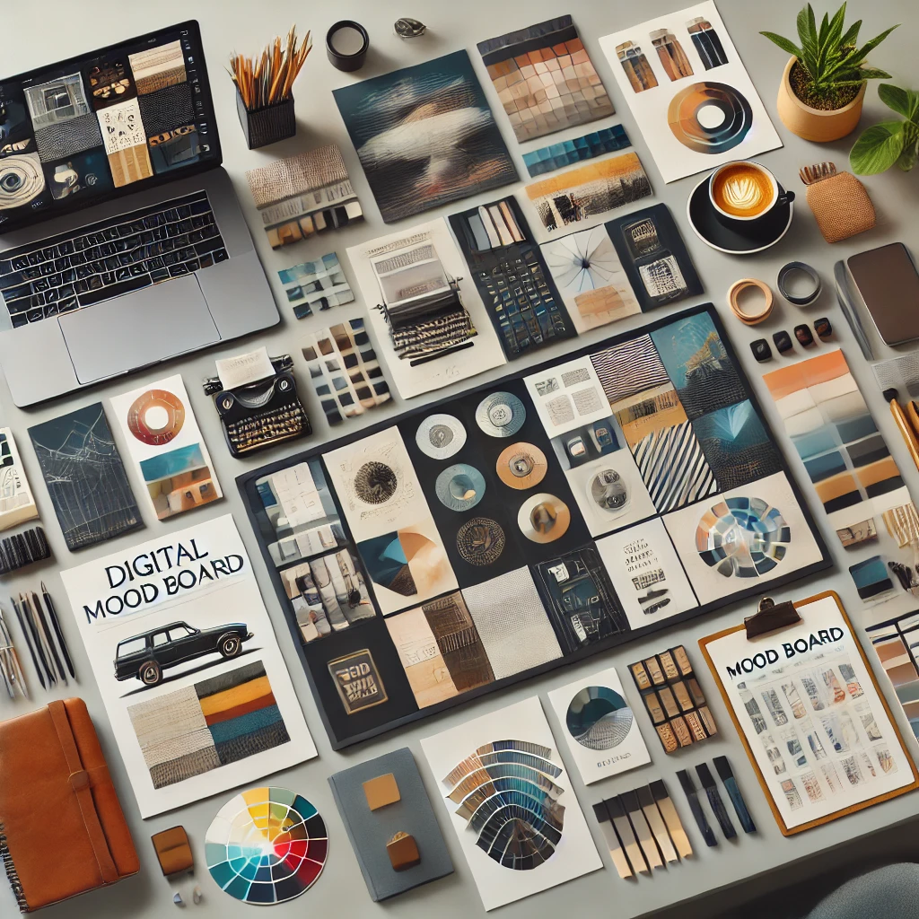
Write your word big and add it last. Then put the board within sight of your easel or desk, at about eye level, so you can glance at it while you work.
Physical vs. digital boards
Both work. The choice is mostly about how you like to think.
- real textures
- real paint swatches
- always visible
- fun to make by hand
- fast to build
- easy to edit
- free tools
- travels with you
Physical boards are better for texture and for keeping the mood in your eye line. Digital boards are better for speed and for collecting on the go. Many artists collect digitally, then print the final nine for a physical board.
Physical board sizes
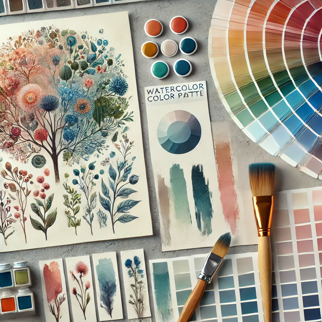
| Size | Best for | Fits |
|---|---|---|
| 11×14 in | One painting | 5-3-1, cozy |
| 16×20 in | A small series | Two 5-3-1 boards |
| 24×36 in cork | A season of work | Several boards |
Cork, foam board, or a fabric-covered board all work. Use pins for things you’ll move and washi tape for paper, since it lifts off without tearing. If you print images, matte art print paper gives truer, less glossy color under studio light.
Digital tools
- Pinterest: best for gathering. Make a secret board per project.
- Canva: free templates and a grid layout. Easy for a 3×3.
- Milanote: a freeform board, good for notes beside images.
- Illustrator or Procreate: full control if you already use them.
Four board themes to try

Dreamy watercolor: soft focus photos, wet-in-wet paintings, sheer fabric. Word idea: “drift.” Pair it with watercolor techniques for ethereal paintings.
Dark academia: old libraries, candlelight, ink drawings, worn leather. Word idea: “lamplight.”
Celestial: night skies, moons, gold leaf, deep navy. Word idea: “orbit.”
Nature-inspired: pressed leaves, bark texture, mushroom photos, botanical prints. Word idea: “understory.” Great before a botanical sketching session.
For a seasonal spin, see how I create a spring mood board.
Put the board to work
A board you never look at is wall art. Here’s how to make it pull its weight:
- Do three thumbnail sketches from the board before your first real piece. Small, 2×3 inches, ten minutes total. A small sketchbook is perfect for this.
- Mix your palette first. Make a swatch strip of your 60-30-10 colors in watercolor or acrylic before you begin.
- Check it at the halfway point. Step back, look at the board, look at the painting. Does it still match the word?
- Retire it when the series ends. Photograph it, take it down, and start fresh.
Common mood board mistakes
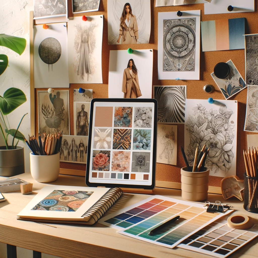
- Too many images. If it’s over nine, cut.
- Mixed light. Noon and dusk on one board confuse your palette.
- No texture. Paper-only boards feel flat.
- No word. You’ll lose the mood once you start working.
- Hiding it in an app you never open.
Investment pieces worth it
Most mood boards cost almost nothing. These are only worth it if you build boards often or work digitally anyway.
Apple iPad Air 13-inch with Apple Pencil Pro
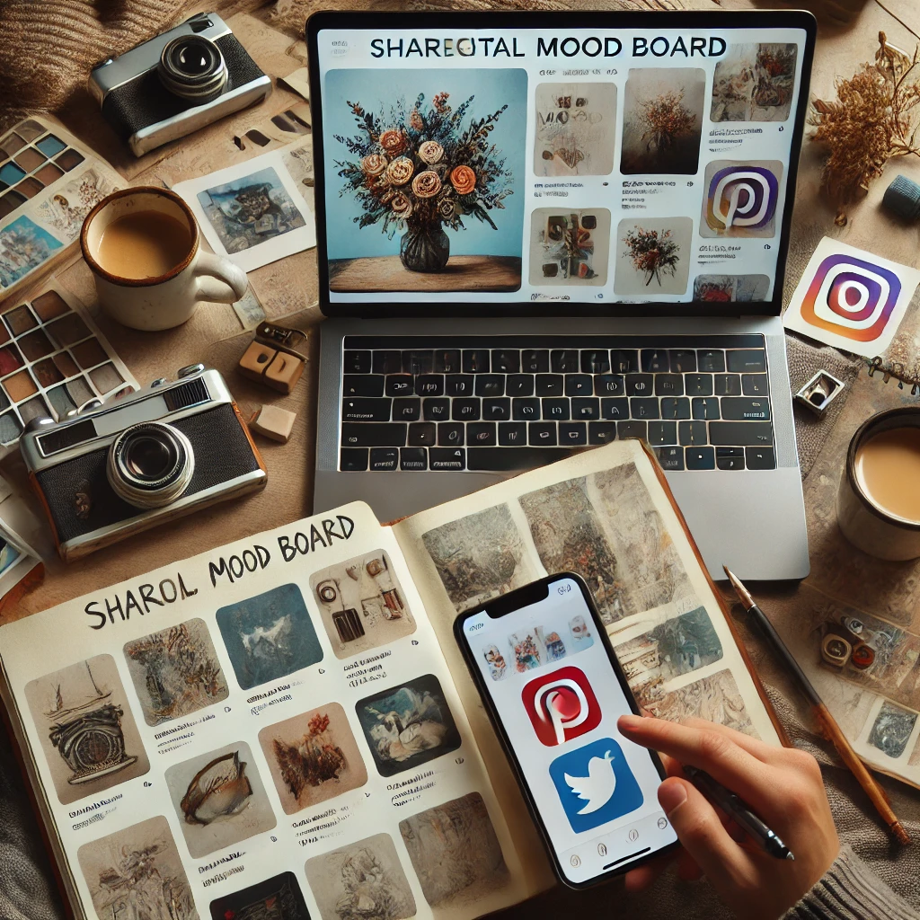
The iPad Air 13-inch (M4) (around $929) with the Apple Pencil Pro (about $99) lets you collect images, build boards in a grid, pick colors, and sketch thumbnails right beside them. The 13-inch screen holds a full 3×3 board at a useful size. Worth it for: artists who already sketch or paint digitally, or who build a board for every project. At three boards a month plus daily sketching for three years, the cost spreads thin. Skip it if: you love paper and only make a board a few times a year. Cork and pins will serve you better.
Daylight Company Lumi Task Lamp
A board is a color reference, so the light you view it under matters. The Daylight Company Lumi task lamp (around $195) has a 95+ CRI rating, so your swatches look on the board the way they’ll look on the canvas. Worth it for: evening painters and anyone matching colors at night. Skip it if: your board and easel sit near a good north window and you paint by day. My studio lighting guide covers cheaper options.
The takeaway
Small and strict wins. Five images, three textures, one word, three colors, and the board goes where you can see it.
Which theme would you build first: dreamy watercolor, dark academia, celestial, or nature-inspired? Tell me in the comments, and save this pin for your next blank-page day.