This post contains affiliate links. If you buy through them, I may earn a small commission at no extra cost to you.
Why does a drawn tear so often look like a little gray sticker glued to the cheek? Because most of us draw the tear. The trick is to draw what the tear does to the light around it.

Here’s my take: a convincing tear is about 20% shape and 80% contrast. Water is clear, so you can’t really draw it. What you can draw is the dark edge where it bends the light, the sharp highlight on its surface, and the soft shadow it casts on the skin. Get those three right and even a simple drop looks wet.
This post is one focused tutorial: a single realistic eye, then a tear. For the whole face, my portrait drawing tips cover structure and proportion, and realistic female portraits goes deeper on light and likeness.
If you only do one thing
Keep the brightest white for two places only: the catchlight in the iris and the highlight on the tear. Everything else, including the white of the eye, should be a light gray. That contrast is what makes both of them sparkle.
What you’ll need
- Graphite pencils from 2H to 8B. The Faber-Castell Pitt graphite pencil tin covers the full range.
- A mechanical pencil for crisp lash and lid details.
- Blending stumps, one for light areas and one for darks.
- A kneaded eraser for lifting and a precision eraser for sharp highlights. My guide to kneadable erasers shows how to shape one to a point.
- A white gel pen for the final sparkle.
- Optional: the Faber-Castell Pitt Graphite Matte set, about $20, for rich darks in the pupil without shine.
For a fuller rundown of portrait gear, see essential art tools for drawing a realistic portrait.
Know the parts before you draw them
An eye looks realistic when the small structures are there, even if the viewer can’t name them. These are the ones to watch for in your reference, top to bottom:
The two people forget most are the lower lid ledge and the tear duct (the small pink bump at the inner corner, called the caruncle). Both happen to be exactly where tears gather, so they matter even more here.
The steps at a glance
Step 1: Sketch the shapes lightly
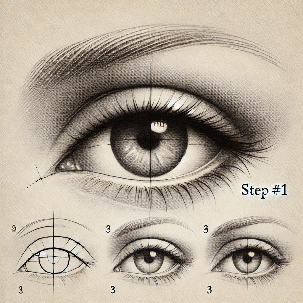
With a 2H or H at feather pressure, sketch the eye shape, the circle of the iris, the pupil and the lid crease. Use a clear reference photo and check the tilt of the eye before anything else. Mark the catchlight as a small shape now so you never shade over it.
Lightly mark where your tear will go too. It should follow the curve of the cheek, never a perfectly straight vertical line.
Step 2: Build the iris and pupil
Fill the pupil with a 4B to 6B, working around the catchlight. Then draw the iris with fine strokes radiating out from the pupil like spokes on a wheel. Darken the outer edge of the iris into a soft limbal ring. That ring alone makes an eye look alive.
The upper lid shades the top of the iris, so make the top third of the iris a little darker than the bottom.
Step 3: Add depth to the whites and lids
The white of the eye is a ball, so shade it like one. Give it a light gray at the corners and right under the upper lid, where the lid casts a shadow. Keep it lightest in the middle near the iris.
Then darken the lash line along the upper lid, leave the lower lid ledge a little lighter than the skin below it, and shade the tear duct softly at the inner corner.
Step 4: Flick in the lashes
Lashes grow out of the lid edge and curve. Start each one at the lid with firm pressure and lift off as you flick outward, so it tapers. Group them in small clumps of two or three instead of evenly spaced single hairs. Lower lashes are shorter, sparser and grow from the outer edge of the ledge, not from the waterline.
For a teary eye, clump the lashes a little more. Wet lashes stick together.
Step 5: Draw the tear
Now the fun part. Start with a faint outline in 2H, then:
- Shade the inside of the tear, darkest along one edge (usually the side away from the light).
- Leave the opposite inner area a touch lighter. Water bends light, so the skin seen through it looks slightly distorted.
- Lift a crisp highlight near the top with a precision eraser.
- Add a soft cast shadow on the cheek just below and beside the drop.
Then add a thin line of water along the lower lid: a slightly darker rim with a tiny bright highlight running along it. That rim tells the viewer the whole eye is wet, not just the cheek.
If you learn better by watching, this tutorial walks through it:
Step 6: Final touches
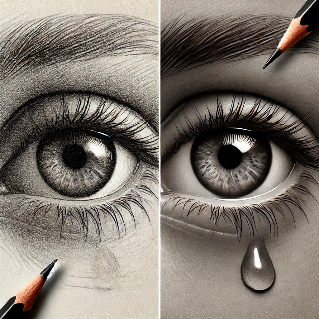
Step back and squint. Push the pupil and the darkest lash roots to your deepest value. Then add the white gel pen to the catchlight and the tear highlight only. A dot or a thin curve is enough. One sparkle too many and it starts to look like glitter.
If you plan to frame the drawing, a workable fixative helps prevent smudging. Spray it outdoors or in a well-ventilated room, and add the gel pen accents after the fixative dries.
Pencil grade cheat sheet
| Part | Pencil grade | Stroke |
|---|---|---|
| First sketch | 2H or H | Feather-light lines |
| Iris | 2B to 4B | Radial lines from pupil |
| Pupil and lash roots | 6B to 8B | Firm, layered fill |
| White of the eye | HB, blended | Soft gray at corners |
| Lashes | 2B mechanical or sharp 4B | Curved flick, lift off |
| Tear | 2B to 4B plus eraser | Dark edge, lifted highlight |
Three tears to try
Once one drop feels easy, try the others. Each tells a slightly different story.
| Tear type | Where it sits | Key detail |
|---|---|---|
| Welling tear | Along the lower lid | Bright rim of water, no drop yet |
| Single drop | Just below the lid | Round shape, strong highlight |
| Tear track | Running down the cheek | Thin shiny line, drop at the end |
A tear track is the easiest to overdo. Keep it narrow and let parts of it fade into the skin so it doesn’t look like a drawn-on stripe.
Why my tear looks flat
- outlined all around
- even gray fill
- no highlight
- no cast shadow
- one dark edge
- crisp highlight
- soft shadow on skin
- follows cheek curve
If your tear still reads as a sticker, it’s almost always the outline. Erase the line on the lit side and let the edge go soft there. For more on building smooth gradients and soft edges, see shading techniques for artists.
Investment pieces worth it
You can draw this whole tutorial with five pencils and an eraser. These are for when detailed eye and portrait work becomes a regular habit.
A full premium graphite range. Fine iris and lash work shows every gap in your grades. The Faber-Castell Pitt graphite pencil tin gives you hard to soft grades in one place. Worth it if you draw faces every week. Skip it if you’re just starting out; an H, HB, 2B, 4B and 6B will carry you a long way.
A high-CRI task lamp. Tears live in tiny value shifts, and those disappear under warm, dim bulbs. The Daylight Company Lumi Task Lamp is rated 95+ CRI at about $195. Worth it if you draw at night. Skip it if you have good daytime window light. Over two years of twice-weekly sessions, that’s under $1 a session.
A light pad for clean transfers. Eyes need a crisp starting sketch, and heavy erasing roughs up good paper. The U.S. Art Supply Lightmaster, about $130, lets you refine the sketch on scrap paper and trace it clean. Worth it if you draw on pricey paper. Skip it if you draw directly in a sketchbook and like it that way.
The takeaway
Draw the eye as a ball with thick lids and gray whites, then draw the tear as contrast: one dark edge, one crisp highlight and a soft shadow on the skin. Save your brightest whites for the catchlight and the tear, and the whole eye will look wet and alive.
Which tear will you try first: the welling tear, the single drop or the track down the cheek? Tell me in the comments.
Save this to your drawing tutorials board so the pencil grade cheat sheet is ready next time you draw an eye.