This post contains affiliate links. If you buy through them, I may earn a small commission at no extra cost to you.
Why do some drawings look like they could roll right off the page while yours stay stubbornly flat? The answer is rarely talent. It’s almost always where you put the dark.
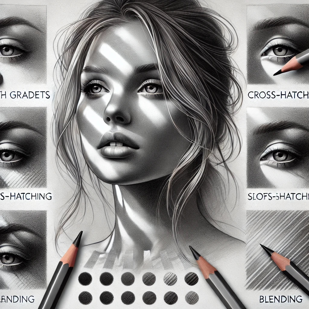
Here’s my take: shading is a map of light, and the technique you pick is just the handwriting. Hatching, stippling and blending can all produce a beautiful sphere. What makes it look round is understanding where the light hits, where it turns away, and where the shadow lands. Learn that once and every technique gets easier.
So we’ll start with light, then cover six techniques, then put it all together in a 15-minute drill.
If you only do one thing
Before you shade anything, decide where your light comes from and draw a tiny arrow in the corner of the page. Every shadow you add should agree with that arrow.
The 6 parts of light on a form
Light a ball with one lamp and you’ll see the same six zones every time. Here they are from the lit side to the floor.
A few rules that make these zones work:
- The core shadow is darker than the reflected light next to it. It sits where the form turns away from the light, a little in from the shadow edge.
- Reflected light is never as bright as the lit side. Beginners often make it glow. Keep it at least two value steps darker than your light side.
- The cast shadow is darkest and sharpest near the object and gets lighter and softer as it stretches away.
- The occlusion shadow is the thin, very dark line where the object touches the surface. It’s small, but it’s what makes an object sit down instead of float.
Your shading toolkit
| Tool | What it’s for | Pick |
|---|---|---|
| Graphite pencils, 2H to 8B | Full value range | Graphite drawing pencil set |
| Graphite tin set | Pencils, sticks and extras | Faber-Castell Pitt Graphite tin |
| Blending stumps | Smooth tonal shading | 12 pc blending stumps |
| Kneaded eraser | Lifting highlights | See kneadable erasers |
| Soft brush or cotton swab | Broad, soft gradients | Any clean soft brush |
Use hard pencils (2H, H) for light values and soft ones (4B to 8B) for the darks. Don’t try to get a deep black by pressing hard with an HB. You’ll polish the paper into a shiny patch that won’t take more layers.
Not sure which graphite brand to buy? My best graphite pencil brands guide compares them.
6 shading techniques, compared
| Technique | Look | Best for | Tool |
|---|---|---|---|
| Hatching | Lines, energetic | Sketches, ink, texture | Sharp pencil or pen |
| Cross-hatching | Dense, woven | Deep shadows in line work | Pen or HB to 2B |
| Blending | Smooth, soft | Skin, skies, spheres | Stump or tissue |
| Stippling | Dotted, grainy | Ink, stone, sand | Fine pen |
| Scumbling | Textured, soft | Foliage, fabric, hair | Soft pencil |
| Tonal shading | Even, controlled | Realism, value studies | Range of pencils |
Hatching and cross-hatching
Draw parallel lines close together. The closer the lines and the heavier the pressure, the darker the tone. For cross-hatching, add a second layer at about 45 degrees, then a third if you need more depth.
Curve your lines to follow the form. Straight hatching on a round object flattens it. Curved hatching that wraps around it makes it look round.
Blending and layering
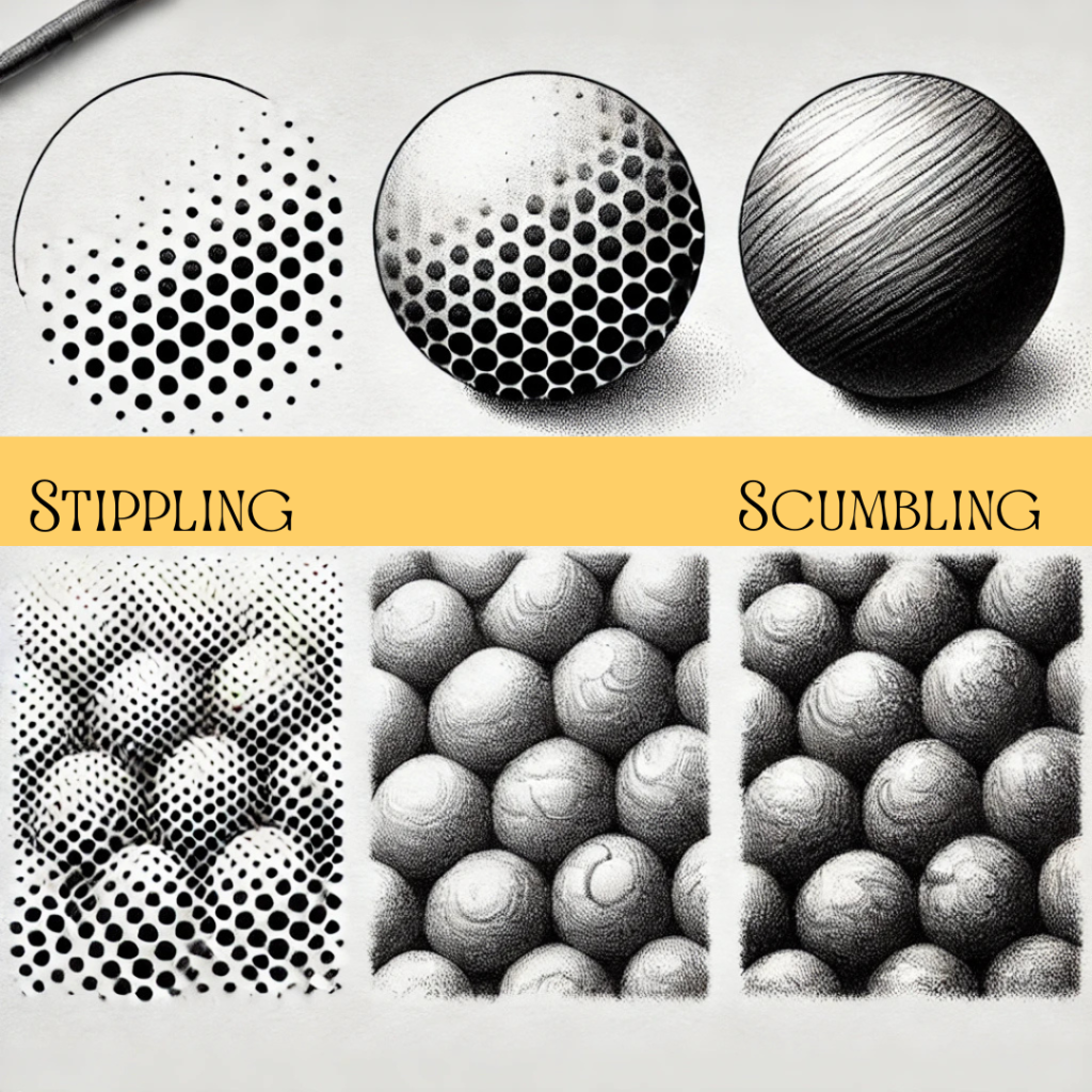
Lay down light graphite with the side of the pencil, then smooth it with a stump. Add another layer and blend again. Three thin layers beat one heavy one every time.
Blend from dark toward light so you don’t drag gray into your highlights. For a full breakdown of blending tools, read how to blend charcoal like a pro. The same principles work for graphite.
Stippling
Build tone with dots. Packed dots read as dark, scattered dots read as light. It’s slow, so try it on a 2 by 2 inch square first. Keep your dots round; if they turn into little dashes, slow down.
Scumbling
Scribble tiny overlapping circles with a soft pencil. Small, tight circles give a fine texture; bigger, looser ones look rougher. It’s lovely for leaves, wool and curly hair.
Contour and tonal shading
Tonal shading is controlled, even pressure building gradual value changes with no visible lines. Contour shading means your strokes follow the curves of the form. Combine them: follow the contour while keeping the pressure smooth.
Ready to push further? Advanced sketching techniques and pencil sketching techniques build on everything here.
If you learn better by watching, this tutorial demonstrates several of these techniques:
The 15-minute sphere drill
This is the single best shading exercise I know. Do it with one technique per session and you’ll see the difference in a week.
- Draw a 3 inch circle and an oval cast shadow on the side opposite your light arrow.
- Make a 5-step value scale beside it so you have a reference for each tone.
- Shade the sphere, placing the core shadow first, then the light side, then the reflected light.
- Darken the occlusion shadow where the ball meets the ground.
- Squint. If you can’t see the core shadow clearly, it isn’t dark enough.
Set a real 15-minute timer. A deadline stops you from fussing over one area and teaches you to see the whole form at once.
Common shading mistakes
| Don’t | Do instead |
|---|---|
| Blend everything smooth | Leave some texture showing |
| Shade without a light source | Pick one light direction first |
| Skip value studies | Make a 5-step scale every session |
| Press hard for darks | Switch to a softer pencil |
| Outline shadows | Let shadow edges soften |
Over-blending is the most common one. It turns crisp, interesting forms into a gray fog. Blend where you want softness, like skin or sky, and leave edges crisp where forms are hard, like the rim of a cup.
Investment pieces worth it
Shading lives and dies by what you can see. These are the upgrades worth considering once you’re shading regularly.
Daylight Company Lumi Task Lamp, around $195. A 95+ CRI lamp positioned on one side gives you a steady single light source for still life setups and shows subtle value differences on the page. Worth it if you draw after dark. Skip it if you already have good daylight from a single window.
MEEDEN Extra-Large Wood Drafting Table, around $230. A tilted surface lets you view your values straight on instead of at a slant, so your gradients look the way you meant them. Worth it if you do long drawing sessions. Skip it if your space is tiny and a tabletop easel works fine.
Faber-Castell Pitt Graphite Matte set, around $20. Not pricey, but it earns a spot here because matte graphite gives you deep darks without the shine regular soft graphite gets. Worth it if your dark areas look silvery. Skip it if you mostly work light and loose.
The takeaway
Shading starts with light: one direction, six predictable zones, and a value scale you can trust. Once you know where the darks belong, any technique, from hatching to blending, will make your drawings look round.
Which technique do you reach for most, and which one do you avoid? Tell me in the comments. And save this for your next sketchbook session.