This post contains affiliate links. If you buy through them, I may earn a small commission at no extra cost to you.
Ever spend four hours on a drawing, every eyelash and fabric thread in place, and it still looks flat? The detail was never the problem. The order you did things in was.
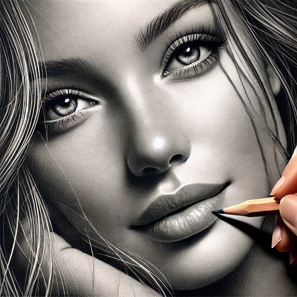
Here’s what I believe: realism is a workflow, and most drawings stall because the artist jumps to detail before the values and edges are settled. Get the big shapes and the light right, and modest detail looks convincing. Skip those stages, and perfect detail just sits on top of a flat drawing.
So this post is the mindset plus a 6-step workflow I recommend for any realistic subject, from a teacup to a face. It focuses on how to work. For a full gear rundown, see realistic sketching tips, tools and techniques, and if you’re choosing a medium, charcoal vs graphite for realistic sketching settles that.
If you only do one thing
Squint at your reference and then at your drawing, side by side, every 15 minutes. Squinting kills the detail and shows you only the big light and dark shapes. If those shapes don’t match, no amount of detail will fix the drawing.
The realism mindset in three sentences
You are drawing light, not things. An eye or a fold of fabric is just a pattern of values and edges, and your job is to copy that pattern faithfully. Outlines barely exist in real life, so the less you rely on them, the more real the drawing gets.
The 6-step realism workflow
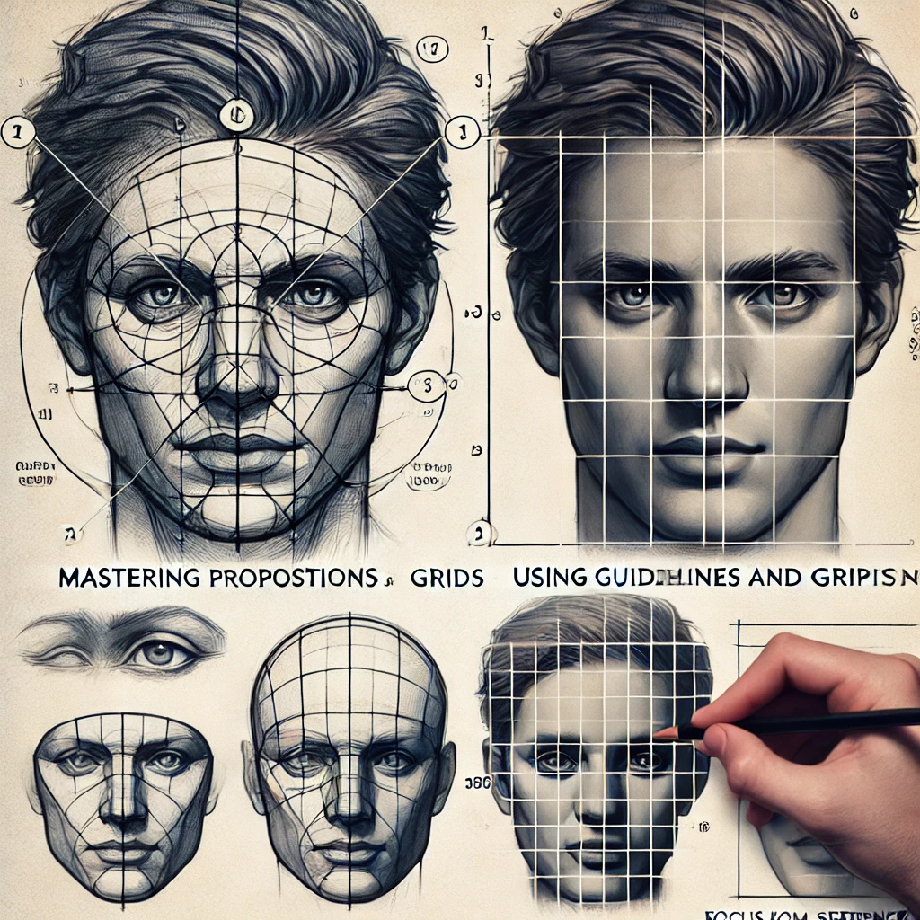
Here’s the whole process at a glance. Each stage builds on the one before it, so resist the urge to skip ahead.
Step 1: Choose a reference that does half the work
A weak reference makes realism nearly impossible. Look for:
- One clear light source. Light from one side gives you readable shadows. Flat flash photos give you almost nothing to shade.
- A full value range. You want true darks and true lights in the same image.
- Good resolution. If you can’t see the texture when you zoom in, you’ll be inventing it.
Print it or display it at the same size you plan to draw. Matching sizes makes measuring far easier.
Step 2: Block in the big shapes
Use a 2H or HB at feather pressure and draw only the largest shapes: the overall silhouette, the main masses, where the shadows begin. Use a light grid or a few guidelines if you like. Check angles by holding your pencil at arm’s length against the reference.
For measuring drills and how angles change with distance, my guide to proportion and perspective sketching goes deeper.
Flip your drawing in a mirror (or snap a phone photo and flip it) at the end of the block-in. Your brain gets used to errors fast. A mirrored view makes a tilted line or a lopsided shape jump out instantly.
Step 3: Map the values
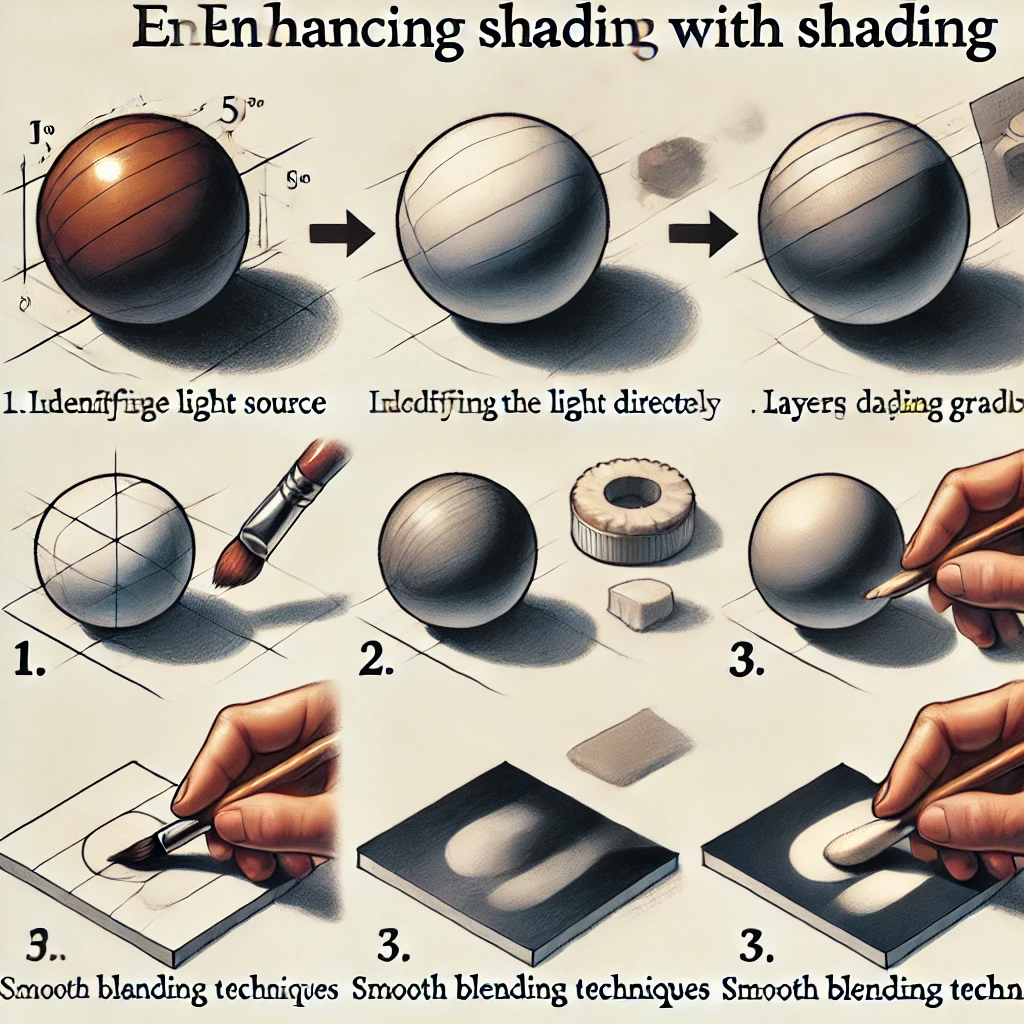
Now decide where your light is coming from and lay in the shadow shapes with an HB or 2B. Work light to dark in layers. Keep the paper white wherever the brightest highlights live, because getting back to pure white later is hard.
A simple 5-value plan keeps you honest:
Blend with a stump between layers if you want a smooth finish, always moving from light areas toward dark. For blending and hatching methods, see shading techniques for artists.
Step 4: Control your edges
This is the step most tutorials skip, and it’s where realism really lives. Every boundary between two shapes is one of three kinds of edge.
A few rules of thumb:
- Hard edges pull the eye. Save them for the focal point and the lit side of the form.
- Soft edges make things round. A cheek, a pear, a sleeve all turn with soft edges.
- Lost edges create atmosphere. When a dark shadow meets a dark background, let the line disappear completely. Your viewer’s brain fills it in, and the drawing feels more real for it.
If every edge in your drawing is equally crisp, that’s the reason it looks cut out and pasted down.
Step 5: Add textures with a recipe
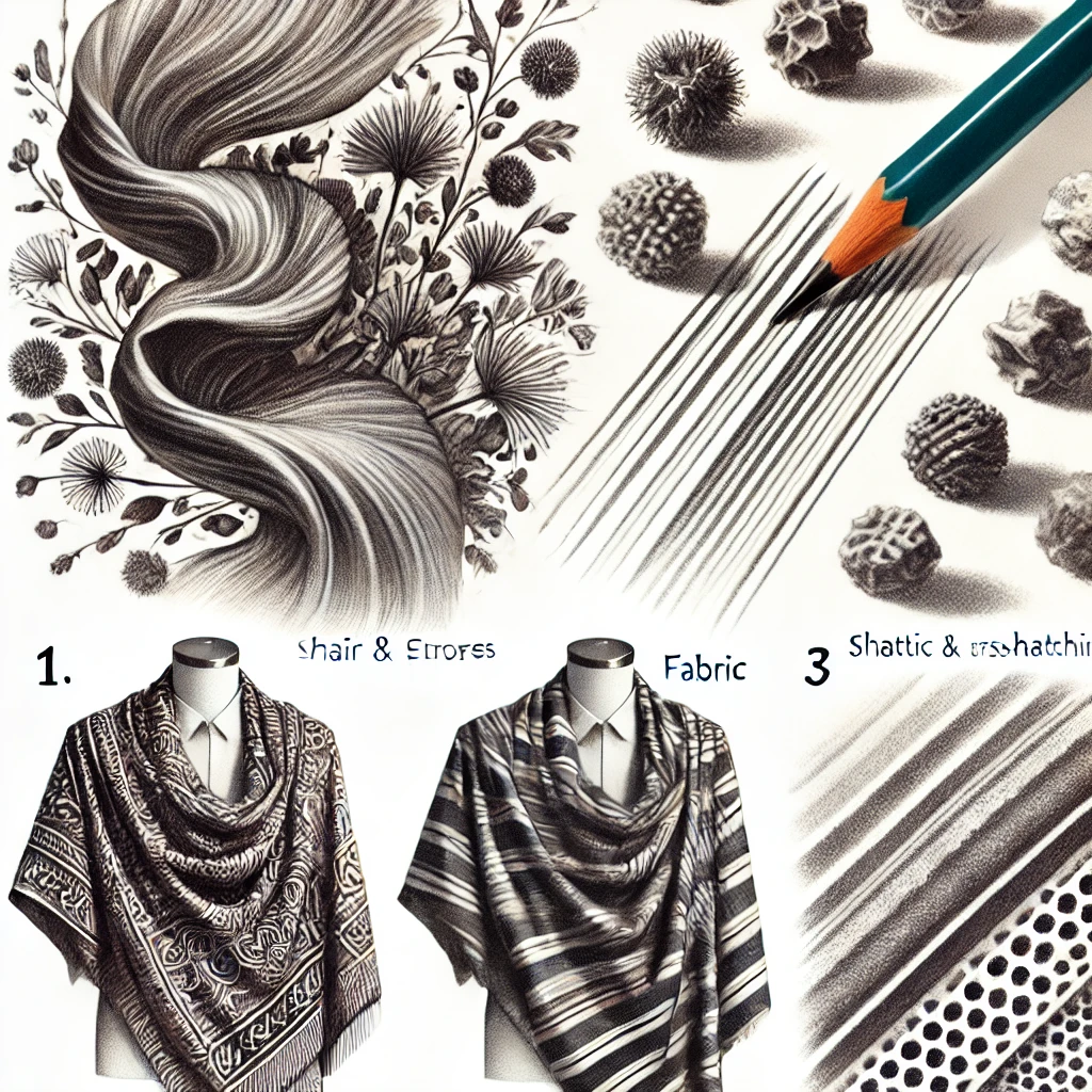
Texture comes last because it sits on top of correct values. Here’s a cheat sheet for common surfaces:
| Surface | Stroke | Tool | Pressure |
|---|---|---|---|
| Hair or fur | Long flicks in growth direction | Sharp 2B to 4B | Light to medium |
| Fabric folds | Smooth gradients, crisp fold tops | Stump plus HB | Light |
| Skin | Tiny circles or fine cross-hatch | Sharp HB to 2B | Very light |
| Wood grain | Wavy parallel lines, dark knots | 2B and 6B | Medium |
| Glass or metal | Hard-edged shapes, sharp highlights | 4B and eraser | Firm in darks |
Hair deserves its own tip: draw the big value masses first, then the strands, and lift a few highlights with an eraser. My guide to drawing realistic hair breaks it down stroke by stroke.
Texture belongs mostly in the light and midtones. Deep shadows swallow surface detail in real life, so keep your darkest areas simple.
Step 6: Make a fresh-eyes final pass
Walk away for at least 10 minutes. Then come back and run three checks:
- Step back six feet. Does it read from across the room?
- Squint again. Do the value shapes still match the reference?
- Mirror check once more for drawing errors.
Then make your last moves: punch up the darkest accents, lift a few crisp highlights, and add a white gel pen sparkle only where the reference truly has one.
If you learn better by watching, this tutorial walks through the process:
How to budget your time
Beginners often spend 90% of their time on detail. Flip that. Here’s a rough plan for a 3-hour drawing:
| Stage | Share of time | 3-hour drawing |
|---|---|---|
| Reference and setup | 5% | About 10 min |
| Block-in | 15% | About 25 min |
| Values | 35% | About 60 min |
| Edges | 15% | About 25 min |
| Textures | 20% | About 35 min |
| Final pass | 10% | About 20 min |
Values get the most time because they do the most work. If you only have an hour, shrink every stage, but keep the order.
The three mistakes that flatten realism
These are the ones I see most:
- Rushing. Detail on a wobbly block-in is wasted work.
- Outlining. A dark line around a shape flattens it. Let value changes describe the form instead.
- Skipping the value study. A 10-minute thumbnail in three values can save a 3-hour drawing.
The tools that cover it
You don’t need much. A graphite range from about 2H to 8B, a blending stump or two, a kneaded eraser, a precision eraser and a white gel pen handle every step above.
If you’re starting from scratch, the Faber-Castell Pitt Graphite Matte set runs about $20 and gives you a soft, low-shine graphite that’s great for deep darks without glare. For a full range of grades in one tin, the Faber-Castell Pitt graphite pencil tin is a solid pick.
Not sure which brand fits your hand? My comparison of graphite pencil brands lays out the differences.
Investment pieces worth it
Everything above works on a kitchen table. These are for when realistic drawing becomes a weekly habit and you want long sessions to feel easier.
A high-CRI daylight lamp. Subtle midtones vanish under warm or dim bulbs, and you end up overworking the drawing. The Daylight Company Lumi Task Lamp is rated 95+ CRI at about $195. Worth it if you draw in the evenings. Skip it if you have steady window light during the day. At two sessions a week for two years, it’s under $1 a session.
An angled drafting table. Drawing flat on a table distorts what you see, so proportions quietly stretch. The Studio Designs Vintage Drafting Table in solid wood tilts and runs about $270. Worth it if you work on paper larger than 9×12 and draw several hours a week. Skip it if you mostly work in a small sketchbook; a tabletop easel fixes most of the distortion for much less.
A light pad for transfers. If you like to refine a block-in on cheap paper and then trace it to good paper, the Artograph LightPad 950 LX gives a large 24×17 inch glowing surface for about $280. Worth it if you work on expensive paper and hate erasing scars. Skip it if you draw directly and enjoy it; a sunny window works for the occasional transfer.
The takeaway
Realism comes from a reliable order: reference, block-in, values, edges, textures, final pass. Spend the most time on values and edges, and save the fun detail for last, when it actually has something solid to sit on.
Which step do you tend to rush through: the block-in, the values or the edges? Tell me in the comments.
Save this to your drawing tips board so the workflow and the texture recipes are handy next time you start a piece.