This post contains affiliate links. If you buy through them, I may earn a small commission at no extra cost to you.
Ever draw a beautiful eye, then a beautiful nose, then a beautiful mouth, and step back to find a face that looks like nobody? Every feature was fine. The structure underneath wasn’t.
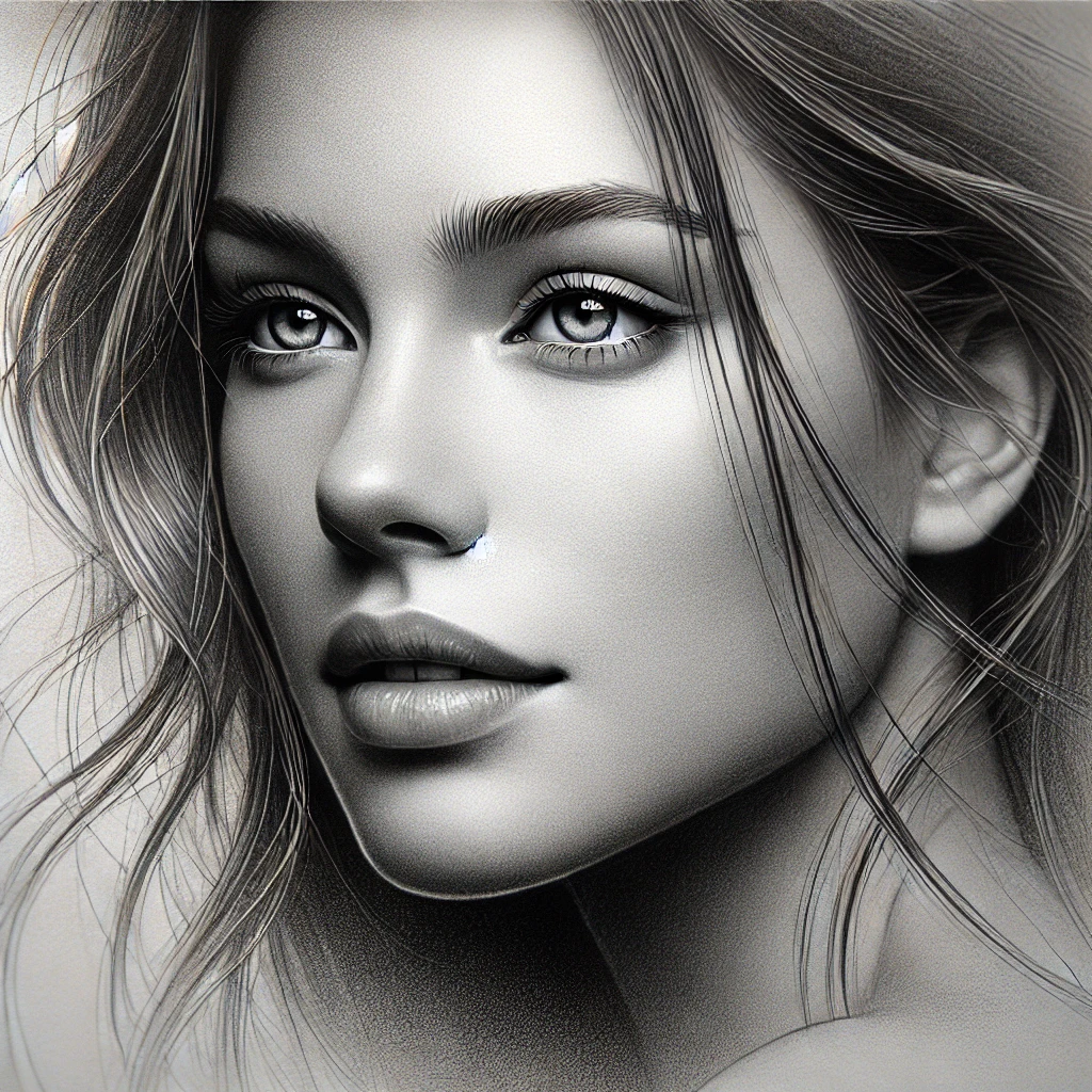
Here’s my take: a portrait is won or lost before you draw a single eyelash. If the head shape and the feature placement are right, average shading still looks like a person. If the placement is off, no amount of gorgeous rendering will save it.
So this guide is about process. You’ll build the head, place the features with a proportion cheat sheet, draw them in the right order, and then shade the skin so it turns around the form. If you’re looking for which pencils and erasers to buy, I covered that in the essential tools for drawing a realistic portrait. Here we put them to work.
If you only do one thing
Draw a light vertical centerline and a horizontal eye line before any feature goes down. Then check every feature against those two lines. Most “it doesn’t look like her” problems are a tilted eye line or a nose that drifted off center.
Step 1: Build the head before the face
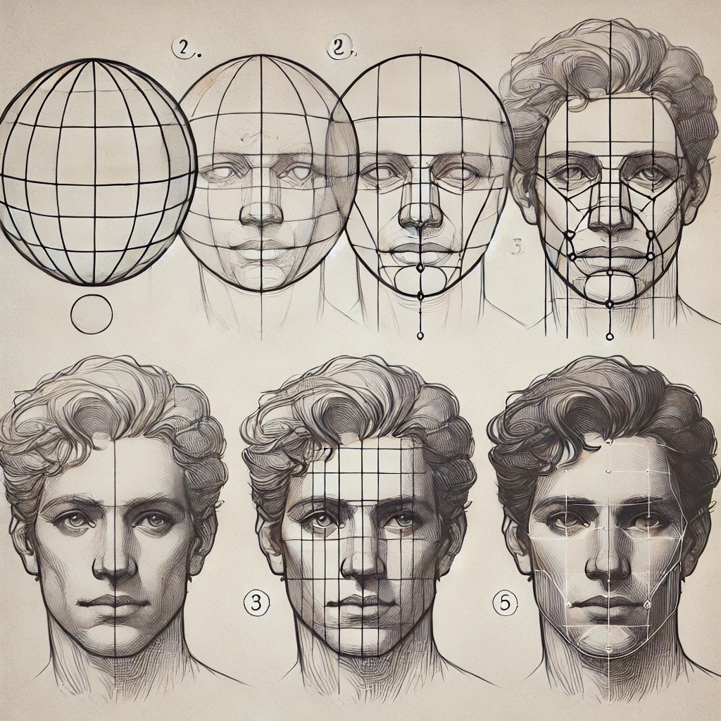
The Loomis method is the classic way to build a head that holds together. It treats the skull as a ball with a jaw attached, so you’re drawing a 3D form instead of a flat oval.
A few practical notes:
- Draw everything at feather pressure with an HB or 2H. These lines should disappear later.
- Let the centerline curve with the head. If she’s turned slightly left, the line curves left too, and the far eye gets a little narrower.
- The brow line, nose line and chin should be roughly evenly spaced. That’s your face in thirds.
Give yourself 5 to 10 minutes on this stage, even when you’re itching to get to the eyes. It’s the cheapest time you’ll spend on the whole drawing.
Step 2: Place features with a proportion cheat sheet
These are approximate guides for an adult face seen straight on. Real people vary, and that variation is the likeness. Use the guides to catch big mistakes, then trust your reference.
| Check | Typical guide | Common mistake |
|---|---|---|
| Eye line | About halfway down the whole head | Eyes placed too high |
| Space between eyes | About one eye width | Eyes too close together |
| Bottom of nose | About halfway from brow to chin | Nose too short |
| Corners of mouth | Roughly under the pupils | Mouth too wide |
| Ears | Between brow line and nose base | Ears too low |
| Face width | About five eye widths | Face too narrow |
That first one surprises almost everyone. The eyes sit near the middle of the head because the hair and skull take up so much space above the forehead. Draw them higher and the forehead shrinks, which is why so many beginner portraits look like the top of the head was cropped off.
To check these distances, measure on your reference and compare on your drawing. A clear ruler makes it fast:

Measure from the reference, never from your own drawing. If you measure your drawing against itself, one small error copies into every feature after it.
For more practice seeing angles and ratios, my guide to proportion and perspective sketching has measuring drills that work for faces too.
Step 3: Draw the features in the right order
Order matters because each feature becomes a ruler for the next. I start with the eyes because they anchor the whole face, then hang everything else off them.
Eyes: draw a ball, not an almond
The eye is a sphere tucked into a socket, and the lids wrap around it. Draw the upper lid as a thick shape with its own shadow, since it casts a soft shadow onto the eyeball. Keep the white of the eye a light gray, never pure white. Only the catchlight should be the brightest spot.
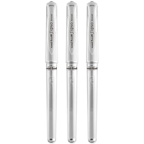
A catchlight is the small reflection of the light source in the iris. Put it in the same spot in both eyes, because both eyes see the same light. If you lost it while shading, a white gel pen puts it right back:
For a full eye walkthrough, try how to draw a realistic eye with tears.
Nose: shade it, don’t outline it
A nose has almost no hard edges. Draw it with value: the shadow on one side of the bridge, the darker underside, and the nostrils as soft dark shapes. Skip the line down the side of the nose. It’s the fastest way to make a face look like a cartoon.
Lips: light the lower lip
The upper lip usually faces down, away from overhead light, so it reads darker. The lower lip faces up and catches light, so leave a soft highlight on it. A shadow just below the lower lip gives it volume without any outline at all.
Step 4: Shade skin so the form turns
This is where a lot of portraits get muddy. Skin is built in layers, with the light areas protected from the start.
- line around every feature
- flat face
- cartoon look
- hard to fix
- shadow shapes first
- soft edges
- form turns
- looks like light
Here’s the layering plan I recommend:
| Layer | Pencil | What to do |
|---|---|---|
| 1. Shadow map | HB or 2B | Lightly fill every shadow shape |
| 2. Midtones | 2B | Build the half tones that turn the form |
| 3. Blend | Stump | Smooth gently, light to dark |
| 4. Darks | 4B to 6B | Eye sockets, nostrils, under the chin |
| 5. Lift | Kneaded eraser | Pull out highlights on nose, brow, lip |
Blending stumps do most of the skin work. Always move from light areas toward dark ones so you don’t drag graphite into your highlights:

Keep one stump “clean” for light skin areas and a second “dirty” stump for shadows. A stump loaded with dark graphite will gray out a cheekbone in one stroke.
For a deeper look at hatching, layering and smooth gradients, see shading techniques for artists.
If you learn better by watching, this tutorial walks through the process:
Step 5: Add expression and depth
A face comes alive in the small asymmetries. One brow a touch higher. A mouth corner pulled slightly up. Look for those in your reference and keep them. Perfect symmetry usually reads as stiff.
For depth, push the contrast where the form turns away from the light: the eye sockets, the side of the nose, under the jaw. Then soften edges on the shadow side and keep them crisper on the lit side. That one habit makes a head look round.
When the face is done, frame it with hair. Treat hair as big value shapes first and individual strands last. My step-by-step guide to drawing realistic hair covers that in detail.
The 3 mistakes that flatten portraits
- Flat features. Drawing eyes as almonds and lips as outlines. Fix it by thinking in forms: a ball for the eye, a wedge for the nose, two curved planes for the lips.
- Misaligned features. The eye line tilts one way and the mouth tilts another. Fix it with the centerline and eye line from the start, and check them again halfway through.
- Over-blending. Smoothing everything until the face looks like plastic. Fix it by blending the midtones, then leaving some texture and crisp edges in the darks and around the eyes.
Investment pieces worth it
Everything above works with a pencil and a stump. These are for when portraits become a regular habit and you want sessions to be easier on your eyes and your neck.
A full graphite range. Once you’re layering skin, gaps in your grades start to show. The Faber-Castell Pitt Graphite tin covers hard to soft grades plus extras, about $45. Worth it if you’re drawing portraits weekly and keep reaching for a grade you don’t have. Skip it if you’re still on your first few faces; an HB, 2B, 4B and 6B are plenty.

A daylight task lamp. Subtle skin values disappear under warm, dim light. The Daylight Company Lumi Task Lamp is rated 95+ CRI and runs about $195. Worth it if you draw in the evening. Skip it if you have good window light and draw during the day. At two sessions a week for two years, that’s under $1 a session.
An angled drawing surface. Drawing flat on a table means you see the page at a slant, which quietly stretches the lower half of a face. The Stand Up Desk Store adjustable drafting table adjusts in height and angle for about $300. Worth it if your portraits keep coming out long in the chin. Skip it if you work small in a sketchbook; propping it on a tabletop easel solves most of the distortion for a fraction of the price.
The takeaway
Build the head, place the features with a few approximate guides, and shade in layers with your lights protected. The likeness comes from structure first and detail last.
Which feature gives you the most trouble right now: eyes, noses or mouths? Tell me in the comments.
Save this to your portrait drawing board so the proportion cheat sheet is there next time you sit down with a reference.