This post contains affiliate links. If you buy through them, I may earn a small commission at no extra cost to you.
Ever mixed a color you loved on the palette, then watched it look muddy and flat on the canvas? Nine times out of ten, the fix lives in the proportions around that color.
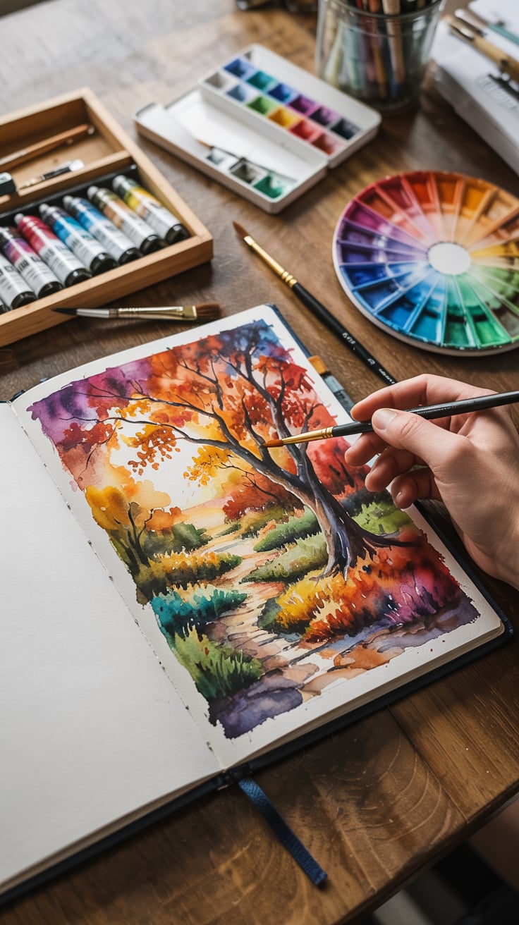
My point of view: a great palette comes down to amounts and values, far more than the perfect five colors. Give one color the spotlight, let two support it, use the brightest one sparingly, and check your darks and lights. Do that and even “ordinary” colors look intentional.
Below you’ll find five ready palettes with approximate HEX codes, a recipe to mix each color from a basic paint set, and the simple rules that keep combinations from turning to mud.
Quick answer: if you only do one thing, use the 60-30-10 rule. Give 60% of your picture to one color, 30% to a second, and only 10% to your boldest accent. Then take a black-and-white photo of your piece to check that the values aren’t all the same.
Color theory in 2 minutes
You only need six terms to build palettes with confidence.
- Primary: red, yellow, blue. You can’t mix them from other colors.
- Secondary: orange, green, violet. Two primaries mixed.
- Tertiary: a primary plus its neighbor secondary, like red-orange or blue-green.
- Complementary: opposites on the wheel (blue and orange). Maximum contrast, and mixed together they make lovely grays.
- Analogous: three or four neighbors on the wheel (yellow, yellow-green, green). Calm and harmonious.
- Monochromatic: one hue in many tints and shades. Foolproof and elegant.
A physical color wheel makes these relationships click faster than any diagram on a screen. This mixing color wheel turns so you can line up complements and see the mixes:

The 3 rules that make any palette work
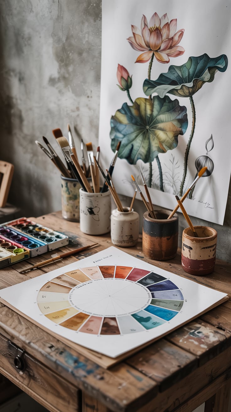
1. The 60-30-10 rule. One dominant color covers roughly 60% of the piece, a secondary color about 30%, and an accent about 10%. With five colors, split the 30 and the 10 between two colors each. The accent is where the eye lands, so put it near your focal point.
2. Check value as well as hue. Value is how light or dark a color is. Photograph your work with your phone’s black-and-white filter. If everything turns the same mid-gray, push a few darks darker and a few lights lighter. Aim for at least three clear steps: light, middle, dark.
3. Pick a temperature team. Warm colors (reds, oranges, yellows) advance. Cool colors (blues, greens, violets) recede. Let one temperature lead and use the other as a small contrast. A warm painting with one cool shadow note looks richer than a 50/50 split.
The basic paint set behind every recipe
Every mixing recipe below uses colors found in most starter sets, in watercolor, acrylic, or oil: titanium white, cadmium yellow (or a hue), yellow ochre, cadmium red, alizarin crimson, ultramarine blue, phthalo blue, burnt sienna, and burnt umber. Black is optional.
HEX codes are approximate. Screens, paper, and pigments all shift color a bit, so treat them as a target for digital work and a reference for paint.
Palette 1: Earthy Naturals
Perfect for landscapes, still lifes with wood and linen, and calm interiors.
| Color | HEX (approx.) | Mix it from | Role |
|---|---|---|---|
| Deep olive | #556B2F | Yellow ochre + ultramarine + touch of umber | Dominant 60 |
| Soft sand | #D8C3A0 | White + yellow ochre + tiny umber | Secondary |
| Cool slate blue | #5A6E7F | Ultramarine + white + touch of umber | Secondary |
| Muted rust | #9C4A2E | Burnt sienna + touch of ultramarine | Accent |
| Warm terracotta | #C8643C | Burnt sienna + touch of cad red + white | Accent |
Get the look: a 50-color watercolor set has these earth tones ready-made, or try oil pastels for a chunky, textured version.

Palette 2: Vintage Sepia
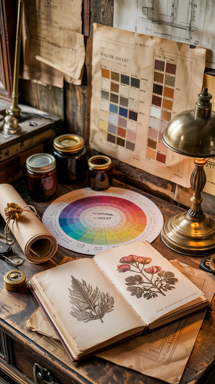
Perfect for nostalgic portraits, old-house interiors, and anything that should feel like a faded photograph.
| Color | HEX (approx.) | Mix it from | Role |
|---|---|---|---|
| Dusty cream | #EFE3CC | White + tiny ochre + tiny umber | Dominant 60 |
| Rich espresso | #4B3621 | Burnt umber + touch of ultramarine | Secondary |
| Faded rose | #C9A0A0 | White + alizarin + touch of umber | Secondary |
| Antique gold | #B8954A | Yellow ochre + touch of burnt umber | Accent |
| Deep charcoal | #36393B | Ultramarine + burnt umber | Accent |
Get the look: these vintage acrylic colors come pre-softened, which saves a lot of mixing.

Palette 3: Dreamy Pastels
Perfect for florals, nurseries, skies, and soft spring sketchbook pages.
| Color | HEX (approx.) | Mix it from | Role |
|---|---|---|---|
| Soft buttercream | #F8EDC2 | White + tiny cad yellow | Dominant 60 |
| Powder blue | #B8D4E8 | White + tiny phthalo blue | Secondary |
| Pale mint | #CDEBD9 | White + tiny phthalo + tiny yellow | Secondary |
| Lavender mist | #D9CCE8 | White + ultramarine + tiny alizarin | Accent |
| Peachy blush | #F6C8B4 | White + cad red + touch of yellow | Accent |
Pastels have a trap: they’re all light, so value contrast vanishes. Add one slightly deeper note, like a lavender shadow, to keep the piece from floating away.
Get the look: soft pastels blend into these shades beautifully, and a soft Princeton Velvetouch brush lays down smooth, even washes.

Palette 4: Bold High Contrast
Perfect for pop art, posters, abstracts, and anything that needs to be read from across a room.
| Color | HEX (approx.) | Mix it from | Role |
|---|---|---|---|
| Deep midnight purple | #2A1A4A | Ultramarine + alizarin + touch of umber | Dominant 60 |
| Electric blue | #1F4FFF | Phthalo blue + a little white | Secondary |
| Vivid turquoise | #00B8C8 | Phthalo blue + tiny yellow + white | Secondary |
| Fiery crimson | #C8102E | Cad red + alizarin | Accent |
| Sunshine yellow | #FFD600 | Cad yellow, straight from the tube | Accent |
Using a dark as the dominant color makes the brights glow. Get the look: neon acrylics and bold markers for crisp graphic edges.

Palette 5: Moody Jewel Tones
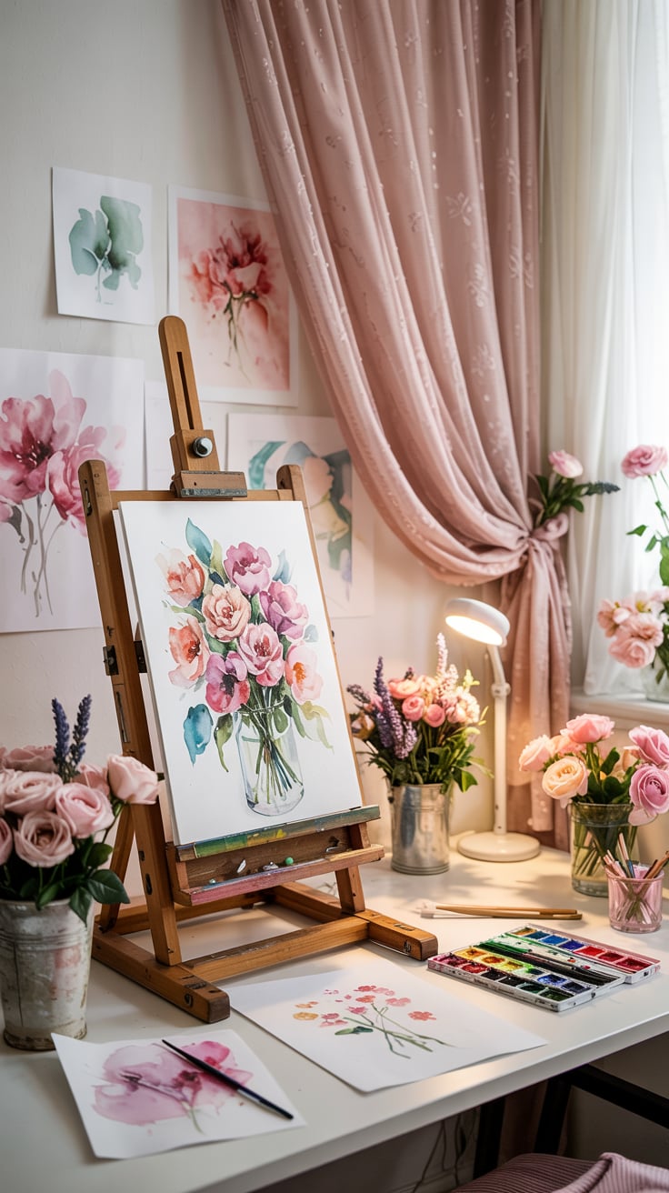
Perfect for evening scenes, rich still lifes, and dramatic botanicals.
| Color | HEX (approx.) | Mix it from | Role |
|---|---|---|---|
| Sapphire | #1F3A93 | Ultramarine + touch of phthalo | Dominant 60 |
| Emerald | #046C4E | Phthalo blue + cad yellow + touch of umber | Secondary |
| Dark amethyst | #4B2A5E | Ultramarine + alizarin | Secondary |
| Burgundy | #6D1A2E | Alizarin + touch of burnt umber | Accent |
| Burnt gold | #B07A1F | Yellow ochre + touch of burnt sienna | Accent |
Get the look: jewel tones love oil, which keeps them deep and glossy. The Old Holland oil intro set is a small, high-quality way to try it. Outline details with fine liners once dry.

Mood to palette cheat sheet
| You want it to feel… | Use | Key move |
|---|---|---|
| Calm, grounded | Earthy Naturals | Low saturation, warm dominant |
| Nostalgic | Vintage Sepia | Cream base, no pure brights |
| Light, gentle | Dreamy Pastels | Add one deeper value |
| Energetic | Bold High Contrast | Dark dominant, bright accents |
| Rich, dramatic | Moody Jewel Tones | Deep values, one gold accent |
How to build your own palette in 5 steps

- Start from a source. A photo, a textile, a flower, a painting you love. Pull five colors from it, or upload the photo to a free tool like Colorslurp.
- Choose the dominant color. Whatever sets the mood gets the 60%.
- Add 2 to 4 supporting colors. Pick neighbors on the wheel for harmony, or one complement for spark.
- Adjust saturation and value. Dull a few colors with their complement so the accent can shine. Make sure you have a real dark and a real light.
- Swatch it. Paint a strip of all five, side by side, in your proportions. Colors change next to each other, and the swatch tells you the truth.
For more combinations to start from, see color palette inspiration.
Tips that save you paint and frustration
- Mix more than you think. Rematching a custom color halfway through is nearly impossible. Mix about 1.5 times what you expect to need.
- Add dark to light, never light to dark. A speck of blue darkens a pile of white. Getting blue light takes a mountain of white.
- Keep a swatch journal. Write the recipe next to every swatch. In a few months you’ll have your own color reference book.
- Check your lighting. A warm 2700K bulb makes yellows vanish and blues go gray. Mix under daylight-balanced light around 5000K whenever you can.
- Try one unexpected pairing a week. Olive and pink. Rust and turquoise. Some of the best palettes sound wrong on paper.
Investment pieces worth it
These higher-ticket picks matter once you’re mixing regularly. Student paint teaches you color theory just fine. Upgrade when the cheap pigment starts holding you back.
A professional watercolor half-pan set

The Schmincke Horadam 24 half-pan metal box is around $157. Professional pigment loads mean cleaner mixes, so your terracotta stays terracotta instead of drifting brown. Half pans last a long time with daily use. The Daniel Smith 24 hand-poured half pans, around $128, are another excellent option with a lot of granulating earth colors.
Worth it if watercolor is your main medium and your mixes keep going muddy. Skip it if you’re still learning the wheel. A student set will teach you just as much at first.
A big colored pencil set
The Faber-Castell Polychromos 120 tin runs around $295. With colored pencil you layer rather than mix, so having many subtle hues on hand matters. For heirloom work, the Caran d’Ache Luminance 40 set at around $172 is built around lightfastness.
Worth it if colored pencil is your main medium. Skip it if you paint mostly. Spend on paint instead.
A color-accurate lamp
The Daylight Company Lumi Task Lamp is around $195 with a 95+ CRI. Every palette in this guide depends on seeing color correctly, and most household bulbs don’t.
Worth it if you paint at night or in a dim room. Skip it if you have a bright north-facing window and paint during the day.
The takeaway
Pick a dominant color, give it 60% of the space, support it with two or three quieter colors, and spend your brightest one sparingly. Then check your values in black and white. That’s the whole secret, and it works with the most basic paint set you own.
Which of the five palettes are you trying first? Tell me in the comments, and save this to your art board so the mixing recipes are there next time you open your paints.