This post contains affiliate links. If you buy through them, I may earn a small commission at no extra cost to you.
Ever finished a graphite portrait, tilted it toward the window, and watched your deepest shadows turn into shiny silver? That glare is the whole charcoal vs graphite debate in one moment.
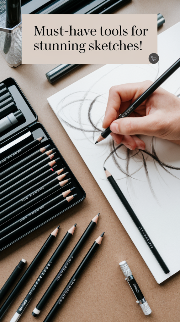
Here’s my take: graphite is the detail tool and charcoal is the drama tool, and realistic drawing gets easier the moment you stop asking one to do the other’s job. Graphite gives you control, crisp edges and clean erasing. Charcoal gives you a velvety, matte black that graphite physically can’t reach. Pick by the darkest dark your drawing needs, and the rest falls into place.
Quick answer: drawing small, detailed or tidy work (eyes, botanicals, architecture)? Graphite. Drawing bold light and shadow, big gestures, or anything that needs true black? Charcoal. If you want both, put graphite down first and charcoal on top, never the reverse.
Charcoal vs graphite at a glance
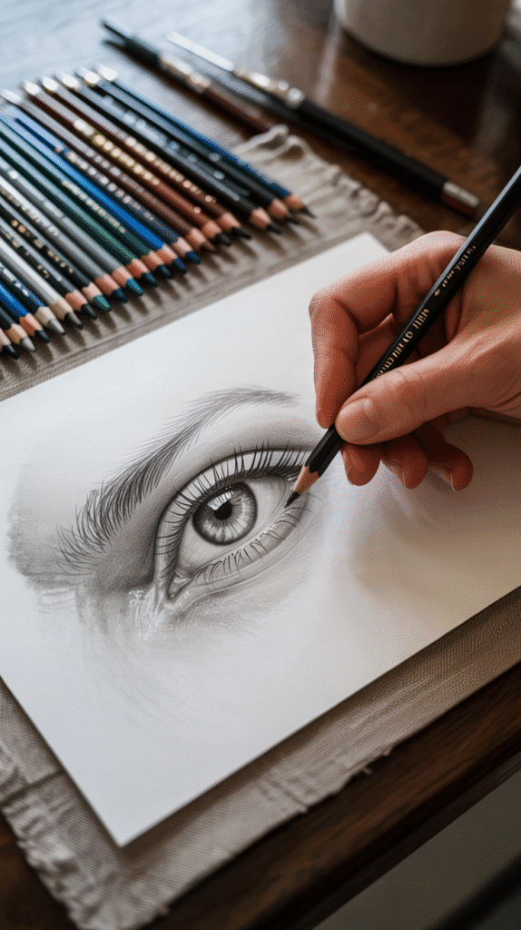
Both are carbon, and both make gray marks on paper. The difference is in how that carbon is bound and how it sits on the surface. Graphite is a crystalline form of carbon mixed with clay, so it slides on in thin, flat, slightly reflective layers. Charcoal is burnt wood (or powdered charcoal pressed with a binder), so it sits on the paper’s tooth as a dry, matte powder.
| Feature | Graphite | Charcoal |
|---|---|---|
| Darkest dark | Deep gray | True matte black |
| Sheen | Shiny when layered | Matte, no glare |
| Detail | Very fine | Good, softer edges |
| Erasing | Clean, easy | Vine lifts, compressed stains |
| Smudging | Low to medium | High, everywhere |
| Fixative | Optional | Strongly recommended |
| Cleanup | A tissue | Wipes, a dust plan |
- fine detail
- clean erasing
- low mess
- sheen in darks
- true black
- matte finish
- fast big values
- dusty and smudgy
The value range: where each one tops out
This is the part most comparisons skip. Graphite pencils run from hard and pale (around 9H) to soft and dark (around 9B), but even the softest graphite tops out at a deep gray that catches the light. Press harder and you get more shine, not more black.
Charcoal starts where graphite runs out. Vine charcoal gives soft, pale grays that wipe away with a breath. Charcoal pencils and compressed charcoal push all the way to a dense black with no glare at any angle.
That’s why a realistic portrait in graphite alone can look a little flat in photos. The darkest hair or pupil can’t get darker than the sheen allows. If your subject lives in deep shadow, charcoal will save you a lot of frustrated pressing.
Graphite techniques that make it shine (in the good way)
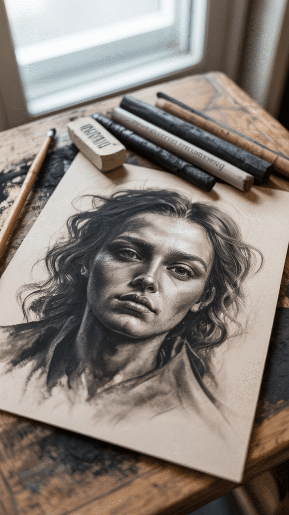
Graphite rewards slow, layered work. A few habits I recommend:
- Build in thin layers. Three light passes with a 2B look richer than one heavy pass with an 8B, and you keep the paper’s tooth open for more.
- Use the grade range on purpose. Hard pencils (2H to H) for the first light layer and edges, HB to 2B for midtones, 4B to 8B only for the final darks.
- Hatch and cross-hatch for texture you can control line by line.
- Lift highlights with a precision eraser rather than drawing around them.
- Blend lightly or not at all. Over-blended graphite polishes the paper and gets even shinier.
A pen-style precision eraser with a tiny tip is the tool for those highlights. It pulls out whiskers, eyelashes and the sparkle in an eye:

For a reliable range of grades in one tin, the Faber-Castell 9000 set covers 8B through 2H:

Want to know which graphite brands are worth it, or why a “lead” pencil isn’t lead at all? See the best graphite pencil brands and graphite vs lead pencils.
Charcoal techniques that make it sing
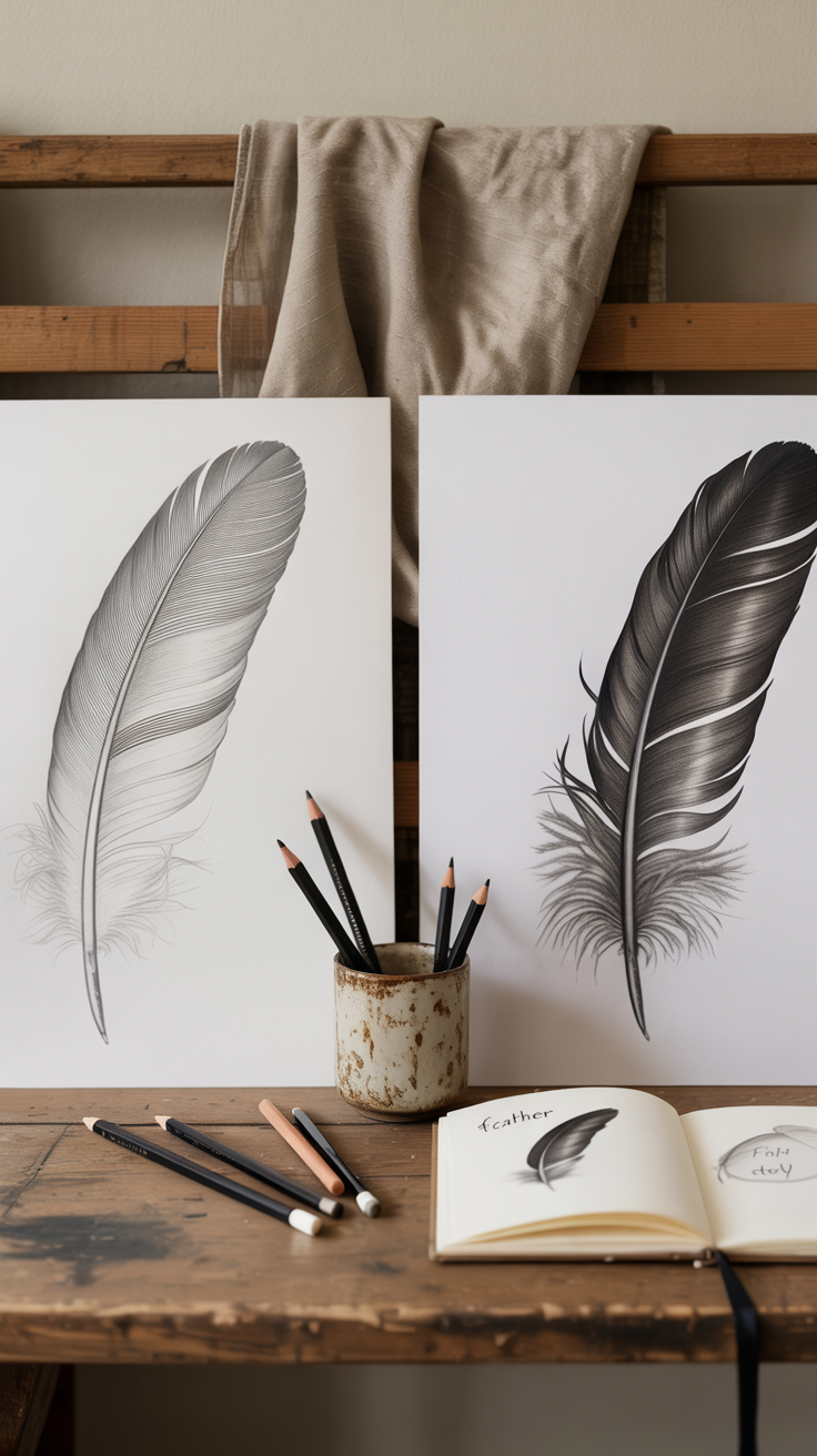
Charcoal rewards big, confident moves. Start loose and refine later.
- Block in with vine charcoal. It’s light and forgiving, so you can sketch the whole composition and wipe away mistakes with a rag.
- Work dark to light, then light to dark. Lay a mid-tone over the page, lift highlights out with a kneaded eraser, then push the darks with a charcoal pencil or compressed stick.
- Blend with tools, not fingers. The oil on your skin can leave blotches the paper won’t release. Stumps and tortillons give cleaner results (my charcoal blending guide covers the details).
- Save compressed charcoal for the end. It’s hard to erase, so treat it like ink for the final darkest accents.
- Fix as you go. A light workable fixative between layers stops smudging and gives you fresh tooth.
A starter kit with vine, compressed and charcoal pencils lets you try every texture before you commit:

Choosing charcoal pencils? My roundup of the best charcoal pencils for artists compares soft, medium and hard options, and the charcoal drawing resource hub has everything else in one place.
Which one should you pick? Match it to the subject
Here’s the decision table I’d use. When in doubt, ask yourself what the darkest part of your drawing needs to look like.
| Subject | Pick | Why |
|---|---|---|
| Eyes, small portraits | Graphite | Fine detail, clean lifts |
| Large portraits | Charcoal | Deep shadows, soft skin |
| Botanicals | Graphite | Crisp edges, tidy page |
| Still life, drapery | Charcoal | Rich folds and contrast |
| Architecture | Graphite | Straight, precise lines |
| Night or moody scenes | Charcoal | Matte black, no glare |
| Sketchbook studies | Graphite | Less smudge on facing pages |
Paper plays a role too. Graphite likes smoother paper for detail. Charcoal needs tooth to grip the powder, so a laid or medium-textured sheet works best. My guides to the best paper for charcoal drawings and sketchbook paper textures go deeper.
Mixing charcoal and graphite: the rules that keep it clean
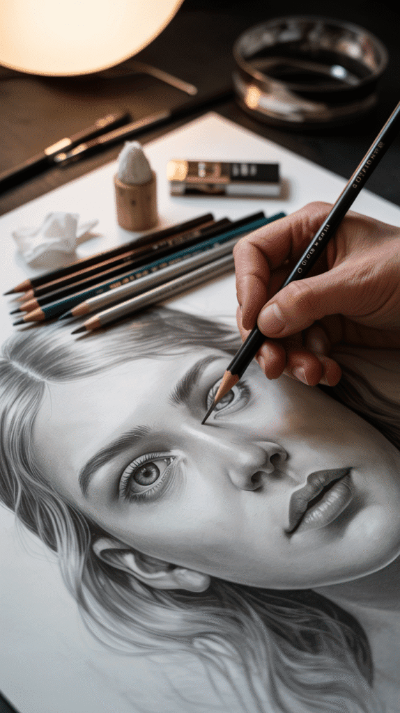
Combining them is how a lot of realistic artists get both crisp detail and deep shadow. It works beautifully if you respect one physical fact: graphite is slick, and charcoal is dry powder.
- Graphite first, charcoal second. Charcoal can sit over light graphite. Graphite over heavy charcoal tends to skate, smear, and leave shiny streaks in your matte blacks.
- Or keep them in separate zones. Graphite for the face, charcoal for the hair and background is a classic split.
- Keep graphite layers light where charcoal will go. Burnished graphite fills the tooth and charcoal won’t stick to it.
- Fix before the switch. A light spray of workable fixative over the graphite stage gives charcoal fresh tooth.
- Erase with a kneaded eraser in mixed areas. Press and lift rather than rubbing. My kneadable eraser guide shows how.
Do this, not that:
| Do this | Not that |
|---|---|
| Graphite under charcoal | Graphite over heavy charcoal |
| Fix between stages | Rub blended areas with fingers |
| Use separate zones | Burnish graphite where charcoal goes |
| Kneaded eraser press-and-lift | Scrubbing with a plastic eraser |
Investment pieces worth it
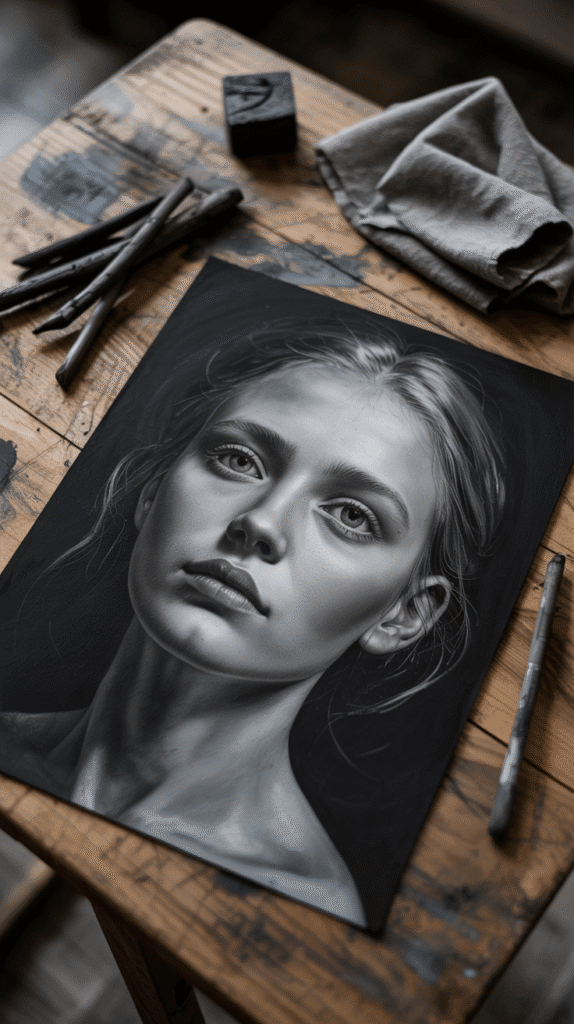
The pencils themselves are cheap. What changes your results over time is light, surface and air. If you draw several times a week, these are the upgrades I’d consider.
Daylight Artist Studio Lamp, around $275. A 95+ CRI daylight lamp shows you true values and helps you spot graphite glare while you work instead of after. Over three years of drawing twice a week, that’s under $1 a session. Worth it if you draw in the evening or in a dim room. Skip it if you have a big north-facing window and draw by day.
Studio Designs Vintage Drafting Table, around $270. An angled surface keeps your view of the drawing undistorted and lets charcoal dust fall away from the paper instead of settling into your whites. Worth it if you work at larger sizes. Skip it if you mostly draw in a sketchbook on your lap.
Levoit Core 400S-P air purifier, around $190. Charcoal dust gets everywhere, especially when you tap a stick or blow off a page. A HEPA purifier near your drawing spot helps keep the fine stuff out of the air. Worth it if charcoal is your main medium. Skip it if you mostly draw in graphite.
Ideas to try this week
Want to feel the difference for yourself? Pick one:
- The same apple twice. Draw it once in graphite and once in charcoal, same light, same size. Compare the darkest shadow.
- The value strip. Make a ten-step strip from white to black in each medium. You’ll see exactly where graphite stops.
- The split portrait. Graphite for the face, charcoal for the hair and background.
- The glare test. Hold both strips at an angle to a window. Notice which one disappears.
For more realism fundamentals, my realistic sketching tips and techniques guide pairs well with this one.
The takeaway
Graphite is your detail and control tool; charcoal is your depth and drama tool. Choose by the darkest value your subject needs, and when you combine them, lay graphite first and charcoal second.
Which side are you on: team graphite, team charcoal, or happily both? Tell me in the comments, and save this cheat sheet for your next drawing session.