This post contains affiliate links. If you buy through them, I may earn a small commission at no extra cost to you.
Ever bought a gorgeous vintage paint color, rolled it on, and realized the room now looks like a 1970s dentist’s office?


That usually isn’t the color’s fault. My take: a vintage palette succeeds or fails on proportions, not on the paint chip. Mustard on every wall is loud. Mustard as 30% of the room, grounded by brown wood and lifted by cream, is warm and timeless. So every palette below comes with exact hex codes and a recipe telling you how much of each color to use.
You’ll also see which kind of art each palette suits, because a moody forest green room feels great for oil painting and a bit heavy for delicate botanical watercolor.
If you only do one thing: pick the palette whose “best for” line matches what you make most, then follow its 60-30-10 recipe exactly for one month before adding anything else. Proportions are what make a room feel intentional.
All 7 Palettes in One Swatch Card

Hex codes are approximate screen matches. Copy them into a mood board, or take them to the paint counter to find the closest real chip.
How to read each recipe below:
- 60% is the color you see most: usually walls or one big rug.
- 30% is furniture, wood tones and large textiles.
- 10% is the sparkle: metal, glass, one bold print.
If you’ve already read my vintage art room color schemes, think of this post as its companion. That one covers seven different schemes, lighting and paint testing. This one is all about the recipes.
Warm Vintage or Cool Vintage?

Before you choose, decide which side of the spectrum you want. Warm vintage feels cozy and lamplit. Cool vintage feels calm and airy.
A quick rule: if your room gets north light, which is cool and steady, the warm end of this bar keeps it from feeling chilly. A south-facing room with hot afternoon sun can handle the cool end beautifully.
1. Muted Mustard and Earthy Brown

The swatches: mustard #C9A13B, earthy brown #6B4A2F, cream #EFE3C8, sage #8A9A6B.
The 60-30-10 recipe:
- 60% cream walls, so the mustard doesn’t overwhelm
- 30% mustard plus earthy brown, in a painted cabinet, a rug and dark wood furniture
- 10% sage, in plants, a ceramic jar or a frame mat
Pairs with: walnut or dark oak, aged brass, woven baskets.
Best for: illustrators and sketchbook artists who want an upbeat, sunny room that still feels grounded.
Try a mustard tone on one piece of furniture first. This mustard paint is an easy way to test the color on a side table or picture frame before you commit a whole wall.
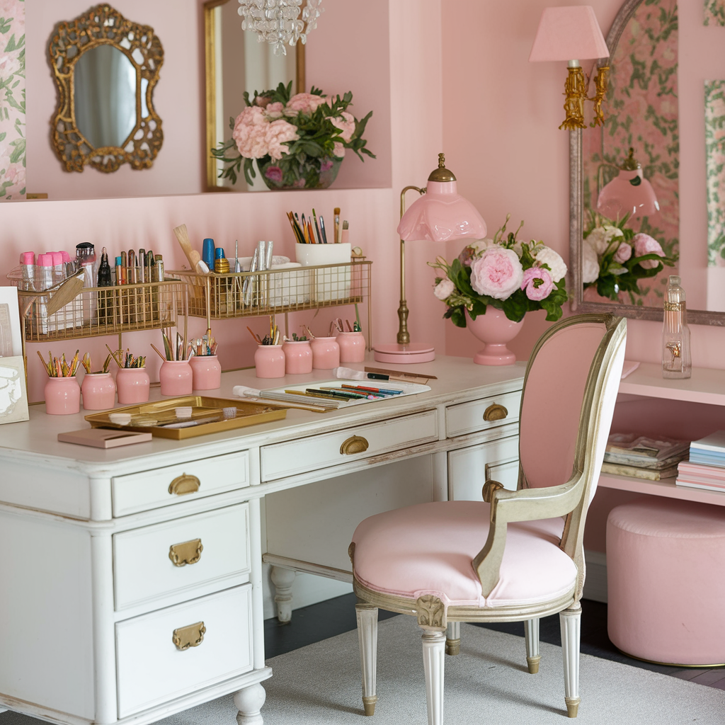
2. Soft Pink and Gold

The swatches: soft pink #E3B7B0, aged gold #B8913F, ivory #F4ECDF, walnut #5C4033.
The 60-30-10 recipe:
- 60% ivory walls with soft pink in curtains or a big rug
- 30% walnut furniture, which keeps pink from feeling sugary
- 10% aged gold, in frames, drawer pulls and a desk organizer
Pairs with: dark walnut, brushed gold, linen textiles.
Best for: watercolor and botanical artists who love a romantic, light-filled space.
Gold is the 10% here, so let it be small and useful. A set of brass desk organizers gives you the glint and holds your pens at the same time.
3. Forest Green and Warm Chestnut


The swatches: forest green #2F4A36, chestnut #8B4F2B, cream #EAE0C8, brass #B08D45.
The 60-30-10 recipe:
- 60% forest green on the walls, or on one accent wall in a small room
- 30% chestnut wood in your table, shelves and frames
- 10% cream and brass, so the room has somewhere bright for your eye to land
Pairs with: chestnut or cherry wood, brass, leather, lots of plants.
Best for: oil painters and anyone who likes a moody, library-like studio for long evening sessions.
This forest green paint suits furniture and smaller surfaces. For the chestnut layer, a rustic oak artist table has the right warm, slightly reddish tone and a tilting top for drawing.
Dark walls swallow light. In a forest green studio, plan on a brighter task lamp than you think, and keep it at 5000K right over your work surface.
4. Ocean Blue and Cream
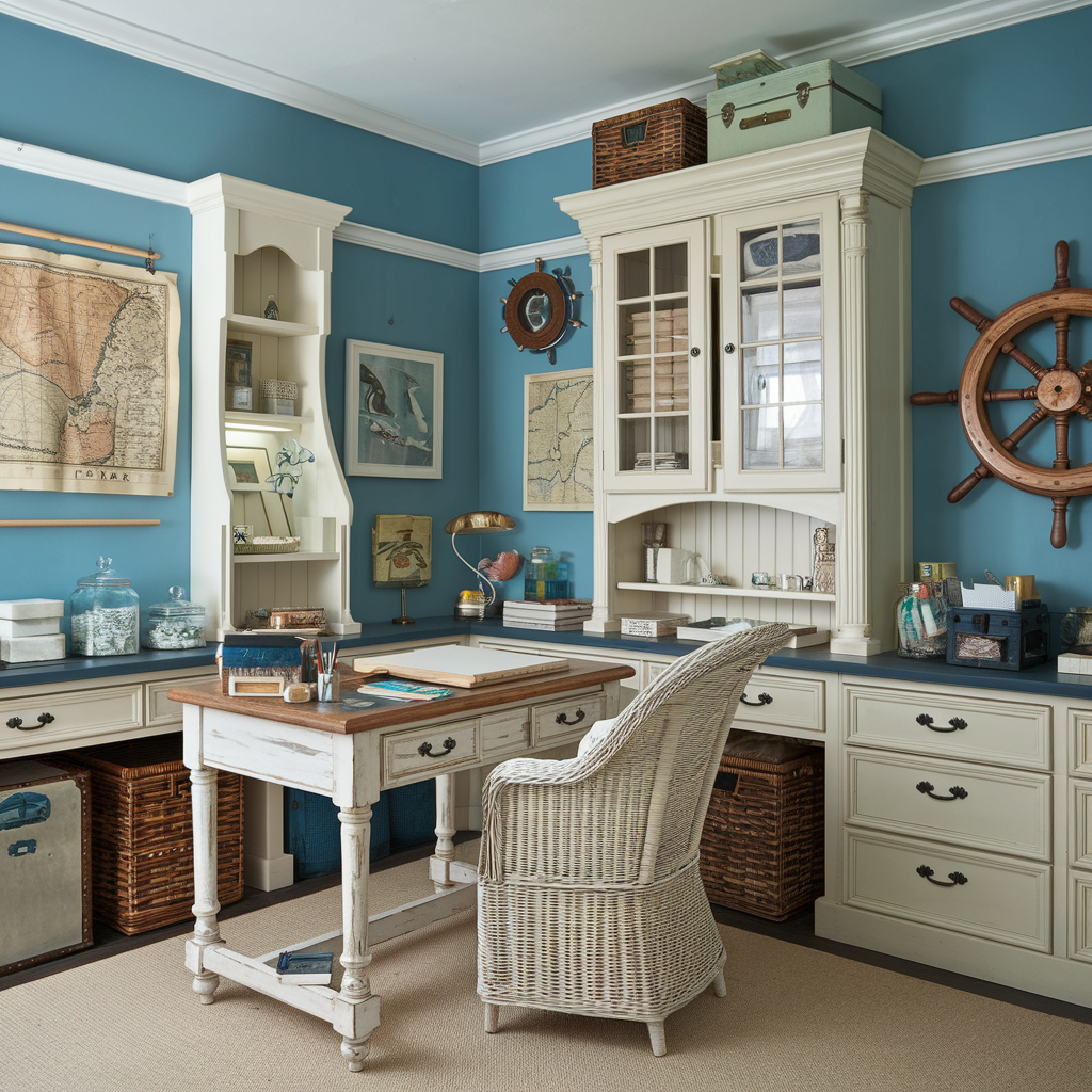
The swatches: ocean blue #2E5C77, warm cream #F1E7D0, driftwood #A89A85, coral #C96F53.
The 60-30-10 recipe:
- 60% warm cream walls and trim
- 30% ocean blue in a painted cabinet, an armchair and textiles
- 10% coral, in a single cushion, a vase or a print
Pairs with: weathered driftwood, white-painted wood, aged silver, rope and rattan.
Best for: landscape and seascape painters, and anyone who wants the calm feel of a seaside study.
The coral accent matters more than it looks. Blue and cream alone can feel cold. One warm 10% pop makes the whole palette feel lived in.
5. Burnt Orange and Charcoal

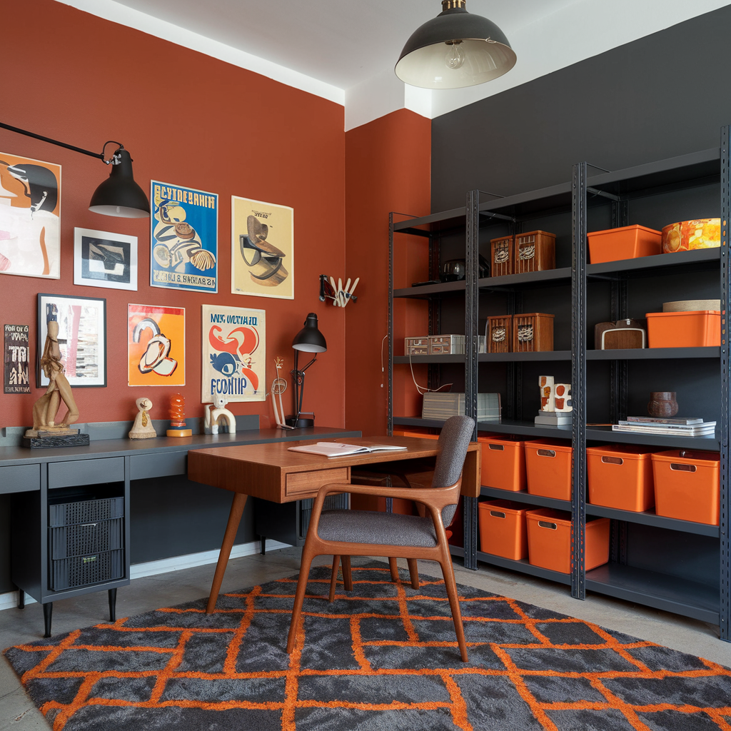
The swatches: burnt orange #C1622D, charcoal #36393B, oat #E6DCC8, copper #A0613A.
The 60-30-10 recipe:
- 60% oat or warm white walls
- 30% charcoal in metal shelving, a stool and a dark rug
- 10% burnt orange and copper, in a chair, pottery and a lamp base
Pairs with: black iron, reclaimed wood, copper, concrete.
Best for: mixed media artists and anyone who likes a retro workshop feel with a hint of industrial grit.
For the charcoal layer, industrial metal shelving holds heavy supplies and looks right at home with burnt orange accents.
6. Dusty Lavender and Ivory

The swatches: dusty lavender #A99BB8, ivory #F5F0E3, soft gray #8C8C88, pewter #9A9A94.
The 60-30-10 recipe:
- 60% ivory walls, which keeps the room bright
- 30% dusty lavender in curtains, a painted dresser and an upholstered stool
- 10% soft gray and pewter, in frames, a tray and a vintage lamp
Pairs with: whitewashed or pale oak, pewter, aged silver, crisp linen.
Best for: pencil and graphite artists who want a quiet, soft-focus room. Lavender plays nicely with gray tones on paper.
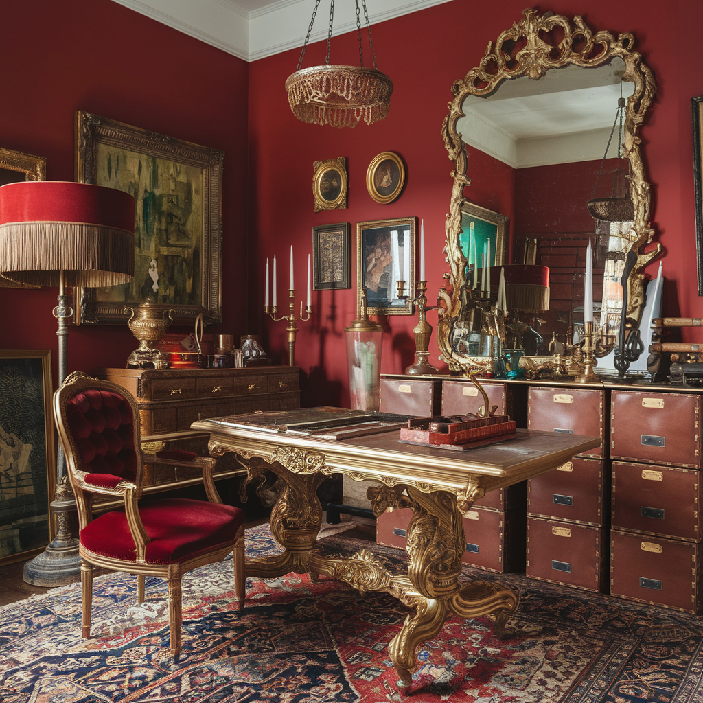
7. Rust Red and Antique Gold

The swatches: rust red #9C3D2A, antique gold #A88A4A, parchment #EDE2C9, ink black #2B2A28.
The 60-30-10 recipe:
- 60% parchment walls
- 30% rust red in a rug, an armchair and a painted cabinet, plus dark wood
- 10% antique gold and ink black, in frames, lamp bases and hardware
Pairs with: mahogany or dark oak, antique gold, worn leather, old books.
Best for: portrait and figure artists who love a warm, old-master feel. It looks especially good with charcoal and sepia drawings on the wall.
For a desk that fits this richer palette, a distressed wood desk adds age without looking fussy.
Palette Pairing Cheat Sheet


Screenshot this one for your next thrift trip.
| Palette | Wall | Wood | Metal | Accent |
|---|---|---|---|---|
| Mustard and brown | cream | walnut | aged brass | sage |
| Pink and gold | ivory | walnut | brushed gold | blush |
| Green and chestnut | forest green | chestnut | brass | cream |
| Blue and cream | warm cream | driftwood | aged silver | coral |
| Orange and charcoal | oat | reclaimed | copper, iron | burnt orange |
| Lavender and ivory | ivory | pale oak | pewter | soft gray |
| Rust and gold | parchment | mahogany | antique gold | ink black |
Which Palette Fits Your Art?
Your studio color sits in your peripheral vision for hours. Here’s how I’d match palettes to what you make.
| If you mostly… | Try | Why |
|---|---|---|
| paint in oils | Forest Green, Rust Red | deep walls feel focused |
| paint watercolor | Soft Pink, Ocean Blue | light walls, airy mood |
| draw in pencil | Lavender, Mustard | soft neutrals, low glare |
| make mixed media | Burnt Orange | sturdy, forgiving, playful |
| work at night | any warm palette | cozy under lamplight |
- brighter room
- easier color judging
- shows dust less
- moody and cozy
- needs stronger task light
- hides scuffs
Investment Pieces Worth It

A palette lives in your big pieces. These three carry color and storage at the same time.
Diversified Spaces Large Format File Cabinet (around $1,340). A light hardwood flat file that holds paper and finished drawings flat. Worth it if you work on large paper and want a forever piece that suits Mustard, Lavender or Ocean Blue rooms. Skip it if your paper rarely goes past 11 by 14 inches; a shallow drawer unit does the job for far less.
Sauder Craft and Sewing Armoire in Mystic Oak (around $525). A warm oak cabinet that hides a whole supply collection behind doors. Worth it if your studio shares a room and you want the vintage wood tone without open clutter. Skip it if you love seeing your supplies or have a dedicated room.
Daylight Company Lumi Task Lamp (around $195). A 95+ CRI task lamp that keeps colors true on your paper while your walls do the moody work. Used four evenings a week for two years, that’s under $0.50 a session. Worth it if you chose a dark palette like Forest Green or Rust Red. Skip it if your work surface gets strong window light and you rarely work after dark.
The Takeaway
The paint chip is only half the story. Follow a 60-30-10 recipe, match the palette to the art you make, and repeat your 10% accent in two or three small places so the room feels pulled together.
Which palette is calling your name, the moody forest green or the sunny mustard? Tell me in the comments, and save this pin so the hex codes are handy at the paint store.
[…] 7 Vintage-Inspired Art Studios to Recreate […]