This post contains affiliate links. If you buy through them, I may earn a small commission at no extra cost to you.
Ever paint five lovely flowers and end up with a painting that still feels off?

Here’s my take: most floral paintings that “don’t work” have a composition problem, not a painting problem. The petals are fine. The arrangement just never told the eye where to land. Choose one star flower, give the bouquet a shape, and let some edges disappear, and even simple brushwork suddenly looks dreamy.
This post is about arranging florals on the page. For the actual wet-on-wet, lifting and splatter techniques, my ethereal watercolor techniques guide covers each one in detail.
If you only do one thing: before you paint, decide which ONE flower is the star. Make it the largest, the most detailed and the one with the strongest contrast. Everything else plays backup.
The 5 Composition Rules I Always Use
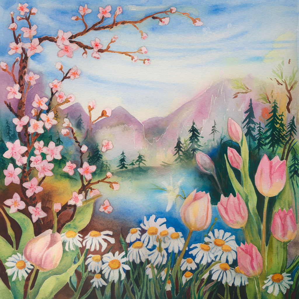
These are simple, and they work for a single stem or a full bouquet.
- One focal flower. Biggest, sharpest, highest contrast. Place it about a third of the way in from an edge, not dead center.
- Odd numbers. Three, five or seven blooms feel natural. Two or four tend to look like a pair of earrings or a grid.
- A shape to follow. Arrange blooms along an S-curve, triangle or crescent so the eye travels instead of bouncing.
- Lost and found edges. Crisp edges where you want attention, soft blurred edges where you want things to recede.
- Negative space. Leave 30 to 40 percent of the paper quiet. Empty paper is what makes the flowers breathe.
Squint at your sketch. If you can’t tell which flower is the star with your eyes half closed, the focal flower needs to be bigger or darker.
4 Layouts for Dreamy Spring Florals
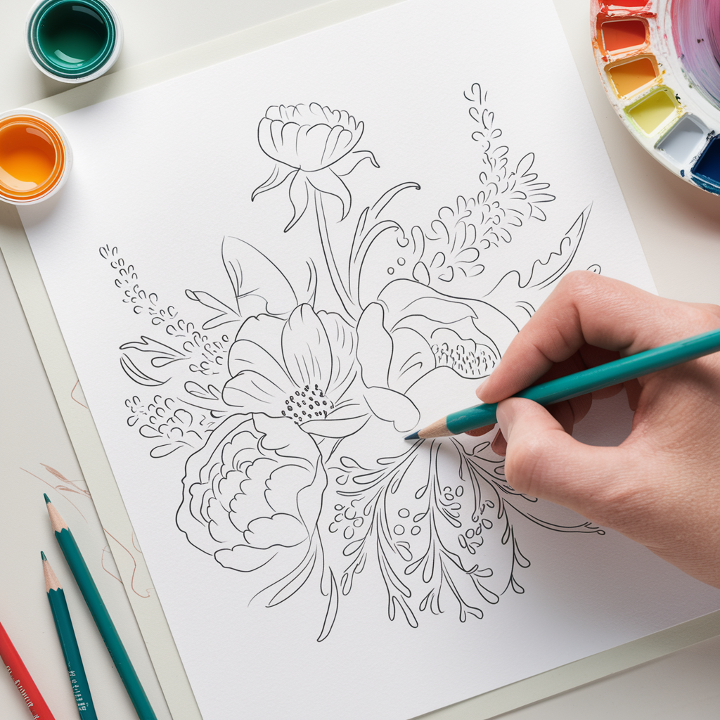
Pick a layout before you pick your flowers. Here are the four I come back to most.
S-Curve: Flowing Branches
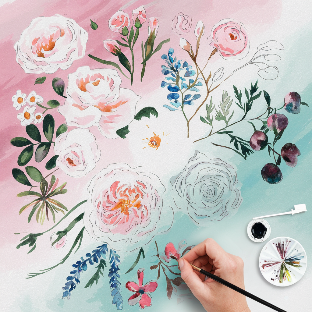
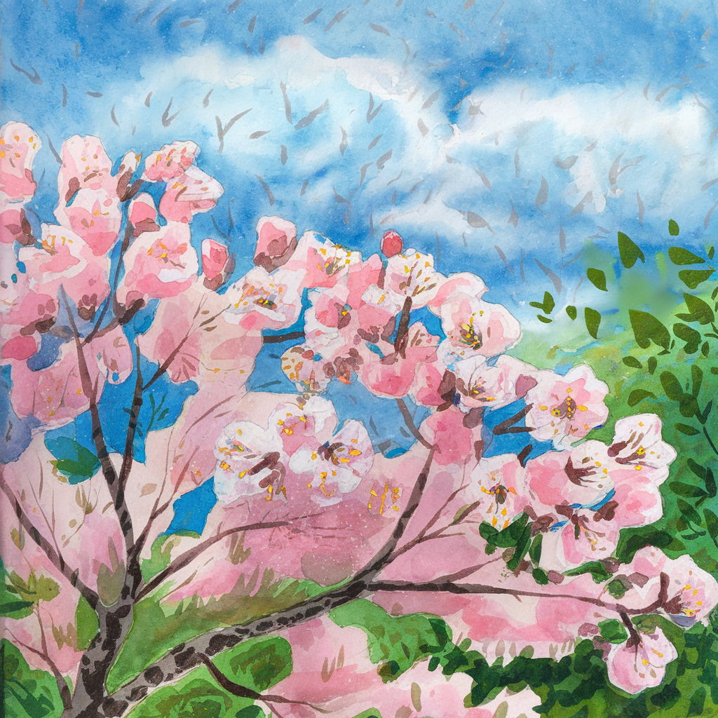
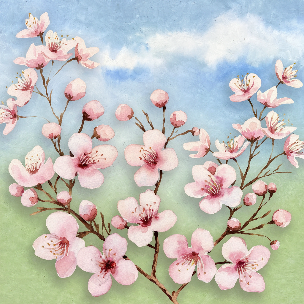
Let the stem or branch swing in a gentle S from one corner to the opposite edge. Put your focal flower on one of the curves, not at the end. Perfect for cherry blossom branches and trailing sweet peas.
Triangle: Classic Bouquet
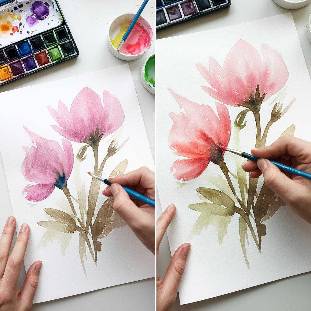
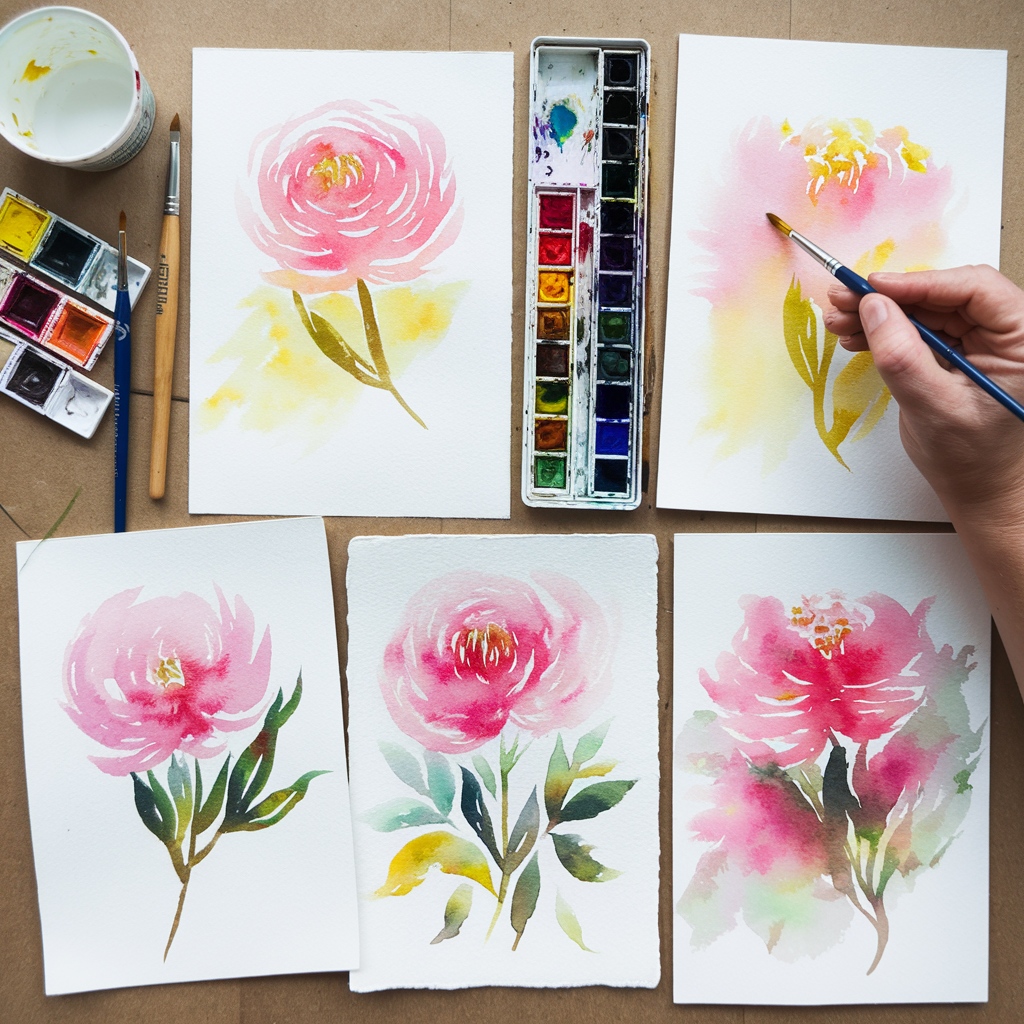
Imagine a triangle with the widest point at the bottom or off to one side. Your focal flower sits low and near the center of mass. Smaller blooms and leaves fill the points. This is the go-to for peonies and roses in a vase.
Crescent: Corners and Cards
A curved arc that hugs one corner or wraps a third of the page. It leaves lots of open space for lettering, which makes it ideal for notecards and invitations.
Scattered Meadow: Wildflowers

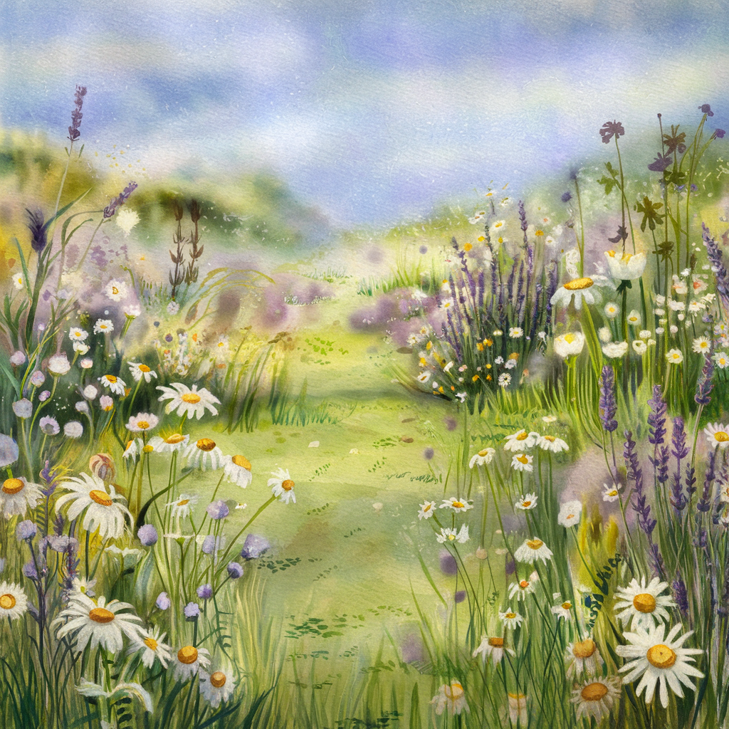
The trick here is clustering. Group flowers in two or three loose clumps of different sizes instead of sprinkling them evenly. Let the tallest stems lean the same direction, as if a breeze passed through.
Flower Shapes Cheat Sheet
Every flower starts as a simple shape. Block in the shape first, then add one signature stroke that makes it read as that flower.
| Flower | Shape to start with | Signature stroke | Role it plays |
|---|---|---|---|
| Peony | large soft circle | ruffled C-strokes | focal flower |
| Rose | spiral in a cup | curved comma marks | focal flower |
| Hydrangea | loose dome | tiny 4-petal dabs | filler mass |
| Poppy | open bowl | crinkled edge, dark center | accent color |
| Cherry blossom | small 5-point star | round notched petals | clusters, branches |
| Eucalyptus | row of coins | round gray-green dots | soft greenery |
| Wildflowers | dots and ovals | flicked stems | movement |
Peonies or roses carry a bouquet. Hydrangeas fill space without stealing attention. Eucalyptus and loose leaves connect everything.
How to Paint a Floral Composition, Step by Step
The painting process stays the same no matter which layout you choose.
1. Sketch Shapes Lightly
Draw your layout line first (the S, triangle or crescent), then place circles and ovals for each flower along it. Mark the focal flower with a small star in the margin so you don’t forget. Keep pencil pressure so light you can barely see it.
2. Lay a Soft Wash
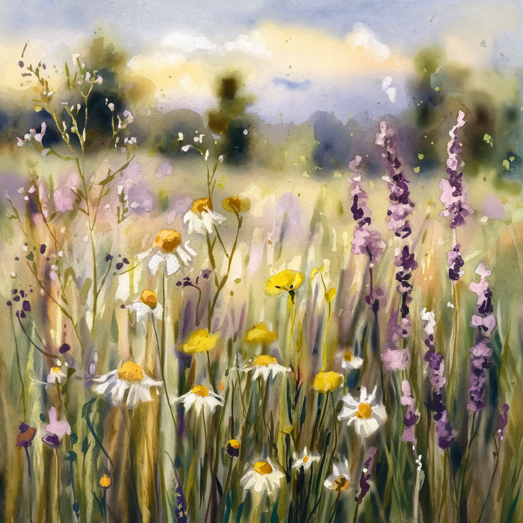
Wet each flower shape and drop in a pale tint of its color. Let the colors kiss and bleed into each other where flowers touch. This first layer sets the dreamy mood, so keep it watery, about the consistency of tea.
Let it dry fully, around 15 to 20 minutes. The paper should feel room temperature, not cool.
3. Build Depth
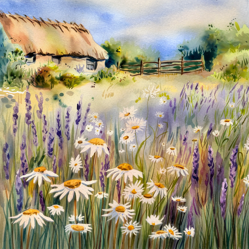
Use wet-on-wet for soft shadows on background flowers and wet-on-dry for crisp petal edges on the focal flower. Work from light to dark, one layer at a time. Most florals look finished at two or three layers.
4. Add Fine Details
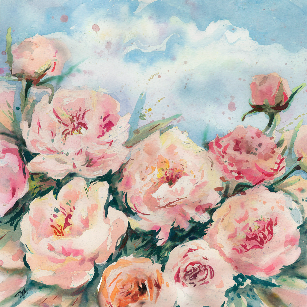
With a small round brush, add petal veins, stamens and deep centers. Save the darkest darks and sharpest details for the focal flower. Background blooms get almost none.
5. Soften Some Edges
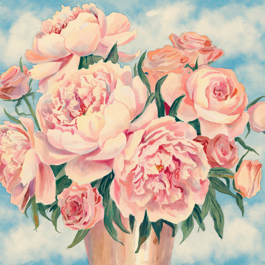
Here’s where “dreamy” happens. Run a clean, damp brush along the outer edge of a few back flowers so they melt into the background. These are your lost edges. Leave the focal flower’s edges crisp. Those are your found edges.
6. Add Leaves and Stems
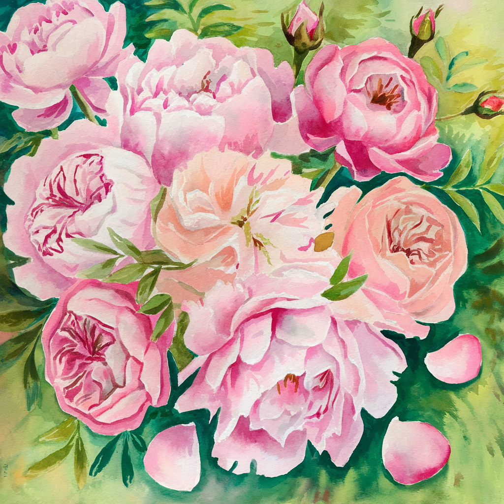
Use sap green or olive green, cooled with a touch of blue for shadows. Leaves are where you fix composition problems: add one to fill an awkward gap, or let a stem lead the eye back toward the star flower.
If you learn better by watching, this tutorial walks through a spring floral painting:
4 Dreamy Spring Compositions to Try
- Cherry blossom branch (S-curve): one knobby branch, three blossom clusters, falling petals drifting into empty space. Full tutorial in my watercolor cherry blossom scenes post.
- Wildflower meadow (scattered): three clumps of poppies, daisies and lavender dots, with grass flicked upward from the bottom edge.
- Peonies and roses (triangle): one large pink peony low and left, two roses above, buds and leaves filling the points.
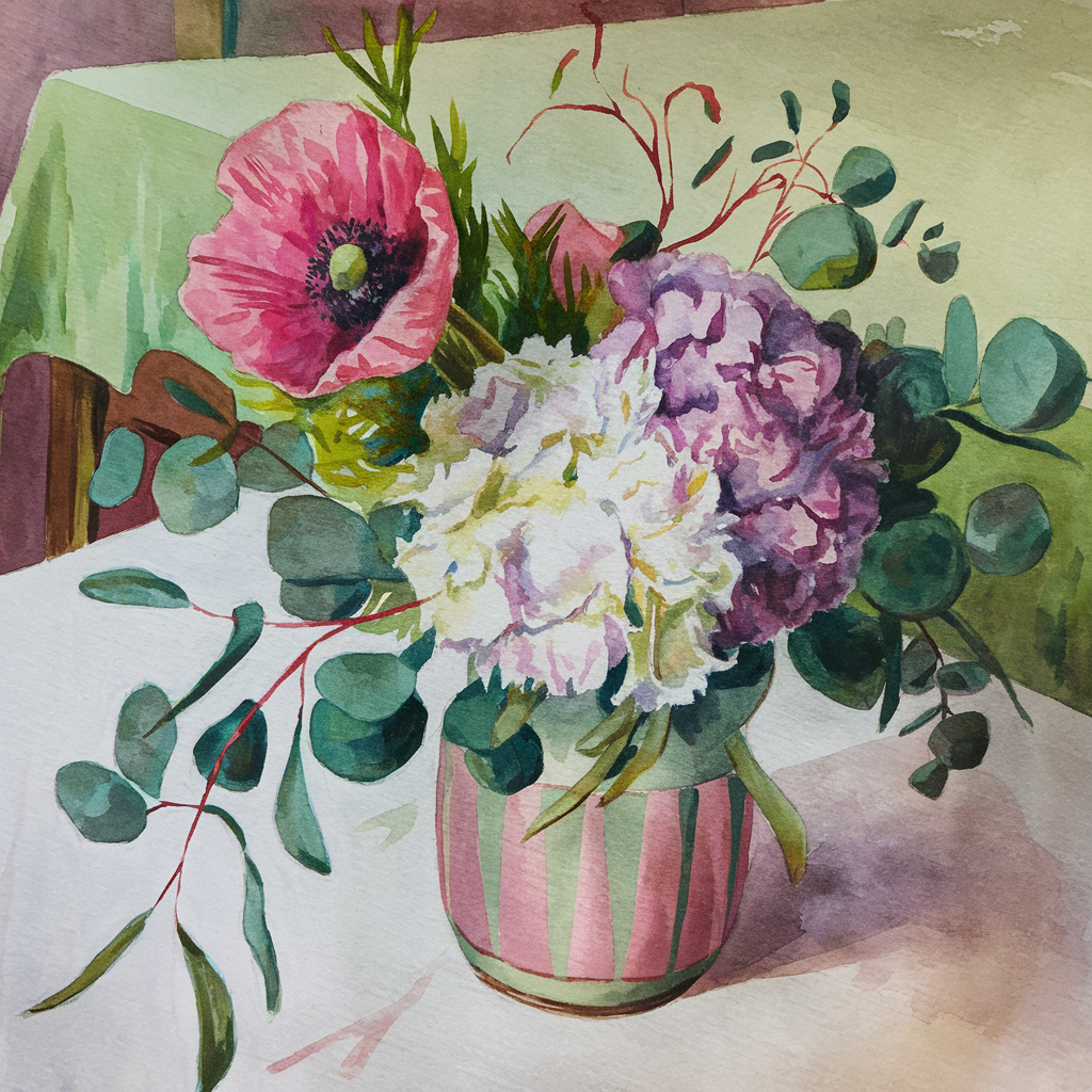
- Cottage bouquet (crescent): hydrangea as the soft mass, one red poppy as the accent, eucalyptus trailing along the arc.
Common Composition Mistakes and Quick Fixes

| Mistake | What it looks like | Quick fix |
|---|---|---|
| No focal flower | eye wanders, nothing lands | enlarge or darken one bloom |
| Everything centered | stiff, like a target | shift the star a third off center |
| Even spacing | polka dots | cluster blooms in uneven groups |
| All crisp edges | busy, flat | soften the back flowers |
| No empty space | crowded page | leave 30 to 40 percent quiet |
| Every flower same size | wallpaper | use one large, two medium, rest small |
Watercolor Tips for Softer Florals

- More water means softer color. For pale petals, dilute until you can see the paper through the paint.
- Layer gradually. Two thin layers look richer than one thick one.
- Leave white paper. Small gaps between petals read as light.
- Let colors bleed. Drop pink into wet green at a stem and leave it. Those soft blends are the dreamy part.
The right supplies help a lot with soft edges. A cotton watercolor paper holds water long enough to soften edges, a mop brush lays big washes in one pass, a round brush handles petals and veins, and transparent watercolors stay luminous when they mingle.
Want to sketch your arrangement before you paint? My botanical sketching 101 guide is a great warm-up.
Investment Pieces Worth It
You can compose a beautiful floral with a basic kit. These upgrades matter most once you start painting larger arrangements.
Hand-poured professional paints. The Daniel Smith 24 hand-poured half pans (around $128) give you rich single-pigment colors that blend cleanly in wet-on-wet bouquets. Over two years of weekly painting, that’s about $1.25 a session. Skip it if you paint a few times a year; an artist-grade starter set is enough.
A tilted painting board. A tilted board lets washes flow gently downward and saves your neck on long sessions. Worth it for anyone painting bouquets larger than 9 x 12 inches. Skip it if you mostly paint small cards.
Color-accurate light. The Daylight Company Lumi Task Lamp (around $195) has a 95+ CRI, so pinks and greens look the same at night as they do in daylight. Worth it if you paint in the evening. Skip it if your table sits by a bright window.
The Takeaway
A dreamy floral painting is mostly a decision made before the brush gets wet: one star flower, an odd number of blooms, a shape to follow and plenty of empty paper. Paint the star crisp, let the back flowers melt, and the arrangement does the rest.
Which layout are you trying first: the S-curve branch or the cottage crescent? Tell me in the comments, and save this to your watercolor board for spring.
Keep going:
[…] Posts You Might Enjoy:🎨 10 Dreamy Sketchbook Ideas to Spark Your Creativity🌸 Watercolor Spring: How to Paint Dreamy Floral Compositions📚 Rustic Elegance: DIY Vintage Window Frame […]